Honda Europe
Designing a Pan European digital platform
Project overview
As one of the worlds most established and recognised brands Honda's online presence spanned over 300 different microsites across 27 territories and over 4 seperate product groups.
The goal of this project was to consolidate all these European into one multi territory online location. All content and UI styling needed to be pulled together into a unfied approach that successfully reflected Honda's unique brand and innovative character.
Role:
Lead visual designer: Visual and UI design, asset creation and defining the UI style for the platform.
The approach
As lead visual designer on the project my role enabled me to explore the companies brand and personality to develop a unique UI system and visual style that could be adapted to all aspects of the site.
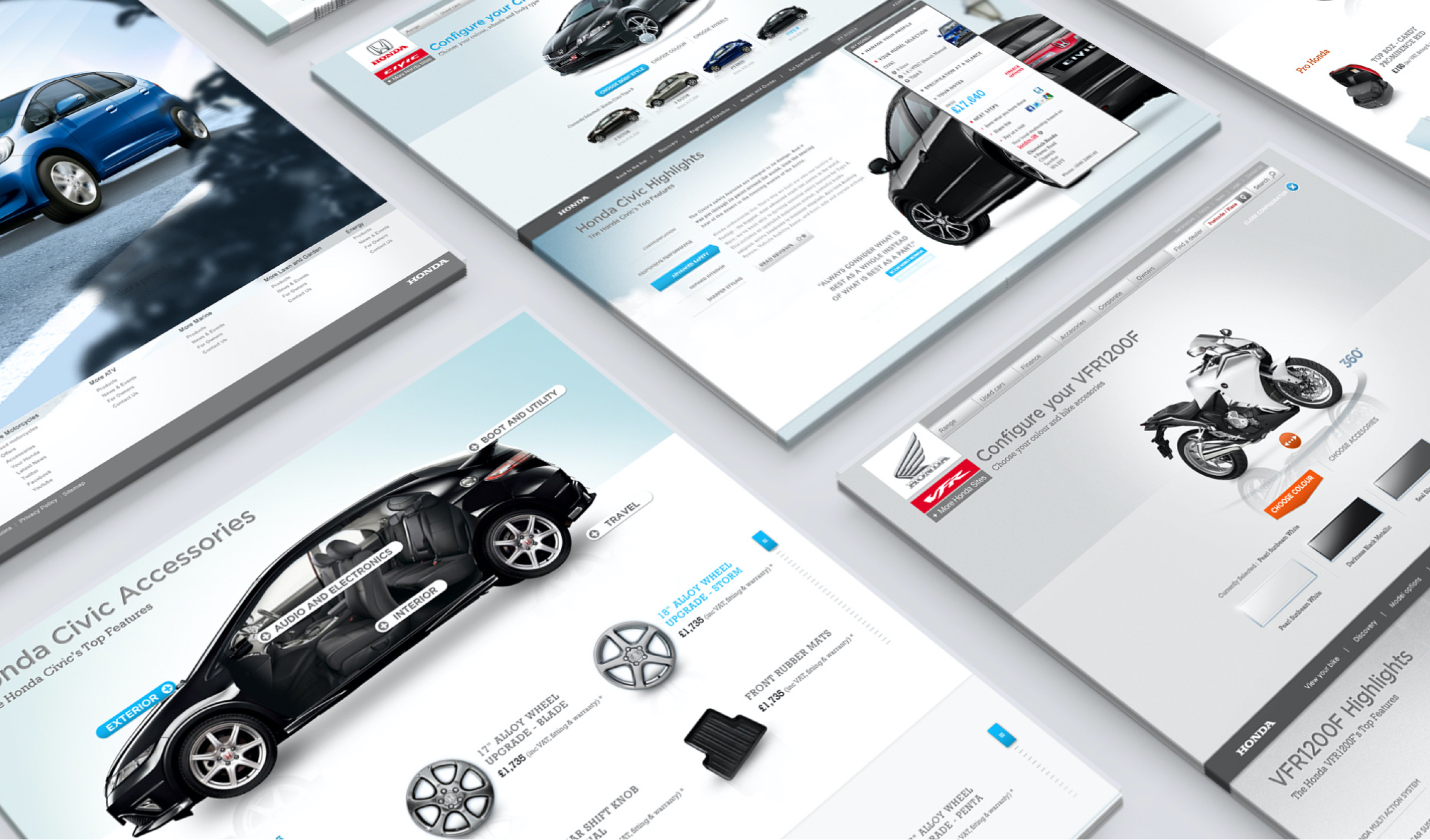
This needed to incoprorate use in different territories with language variations and a style that could work equally across Honda's car, motorcyles, marine and garden product ranges.
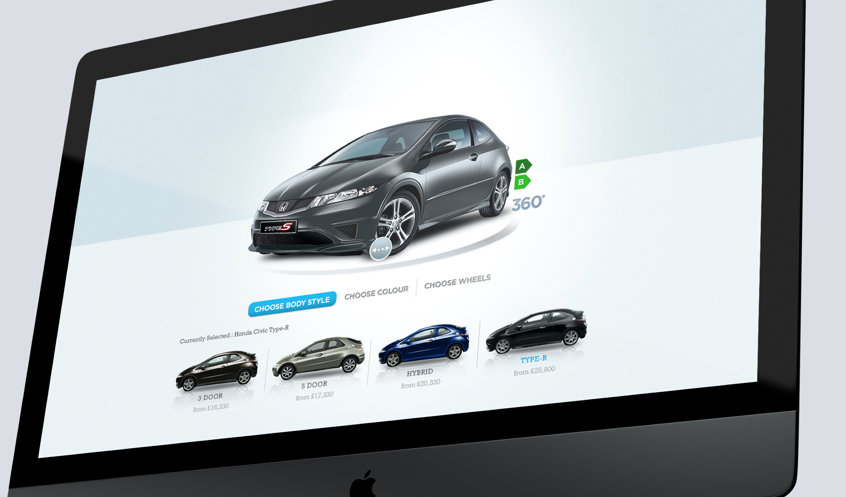
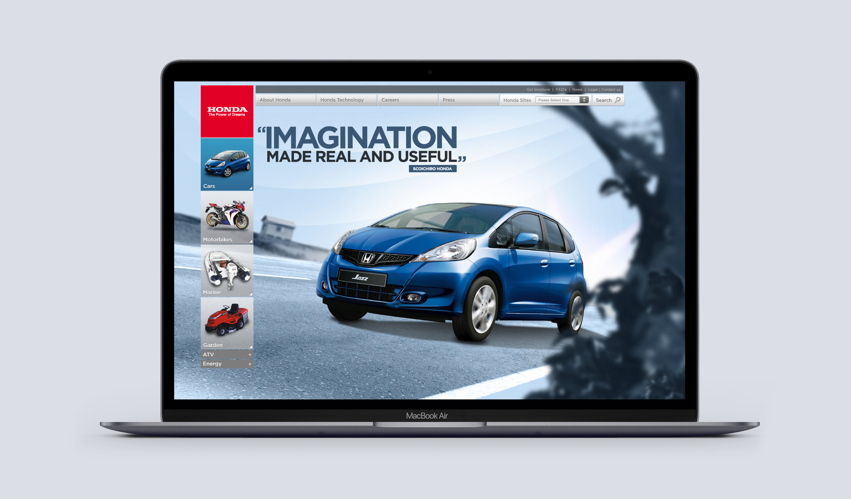
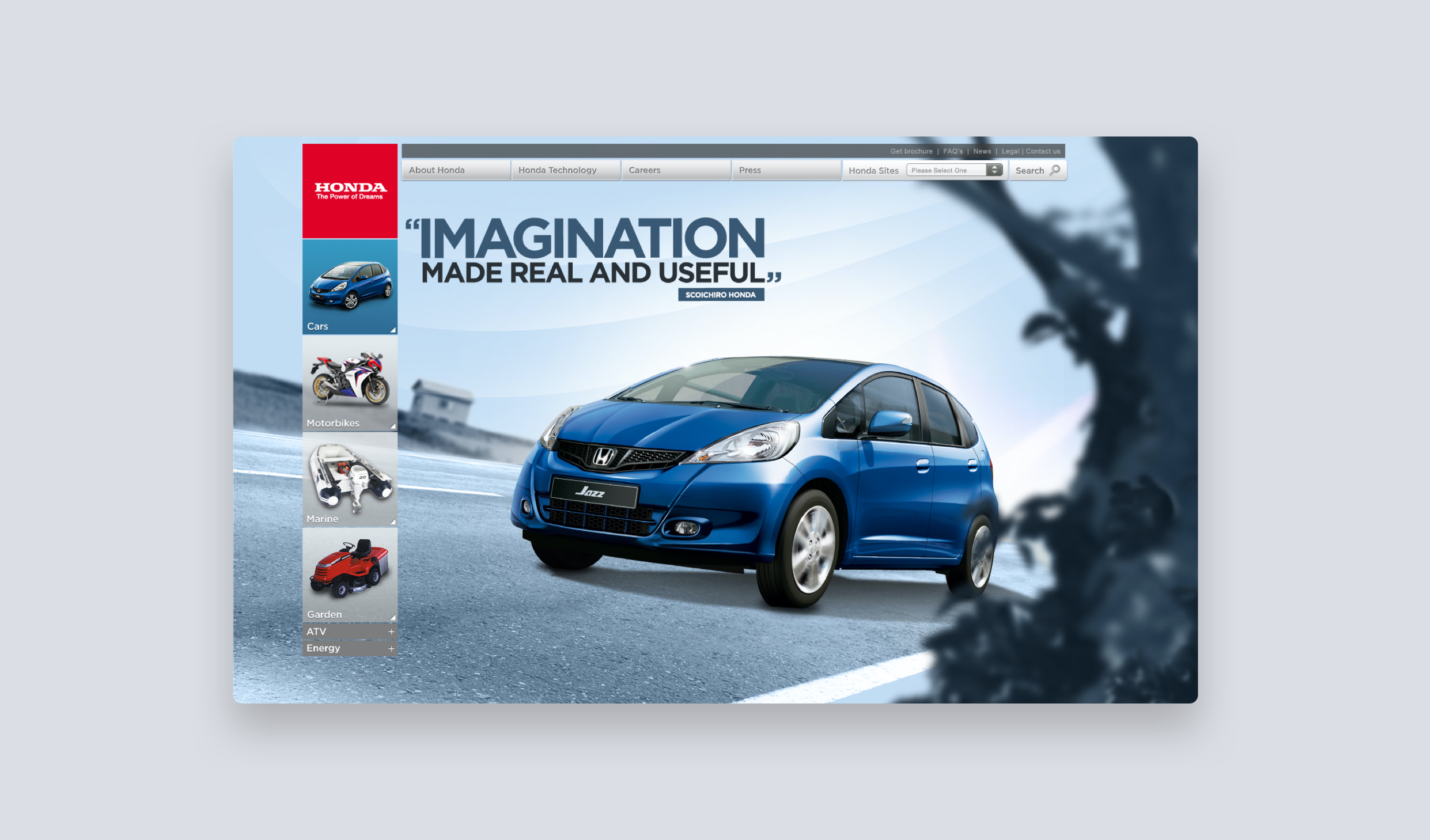
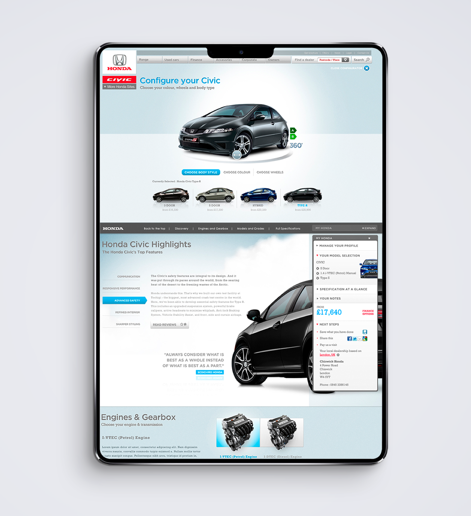
Defining the style
Wanting to reflect the creativity of the Honda brand, the design used a scenically led approach. This incorporated product shots that were layerd with foreground and background elements. Parallax scrolling and movement where also incorporated to help reflected the character of each product, add brand context and ultimatley provide an engaging and memorable experience.
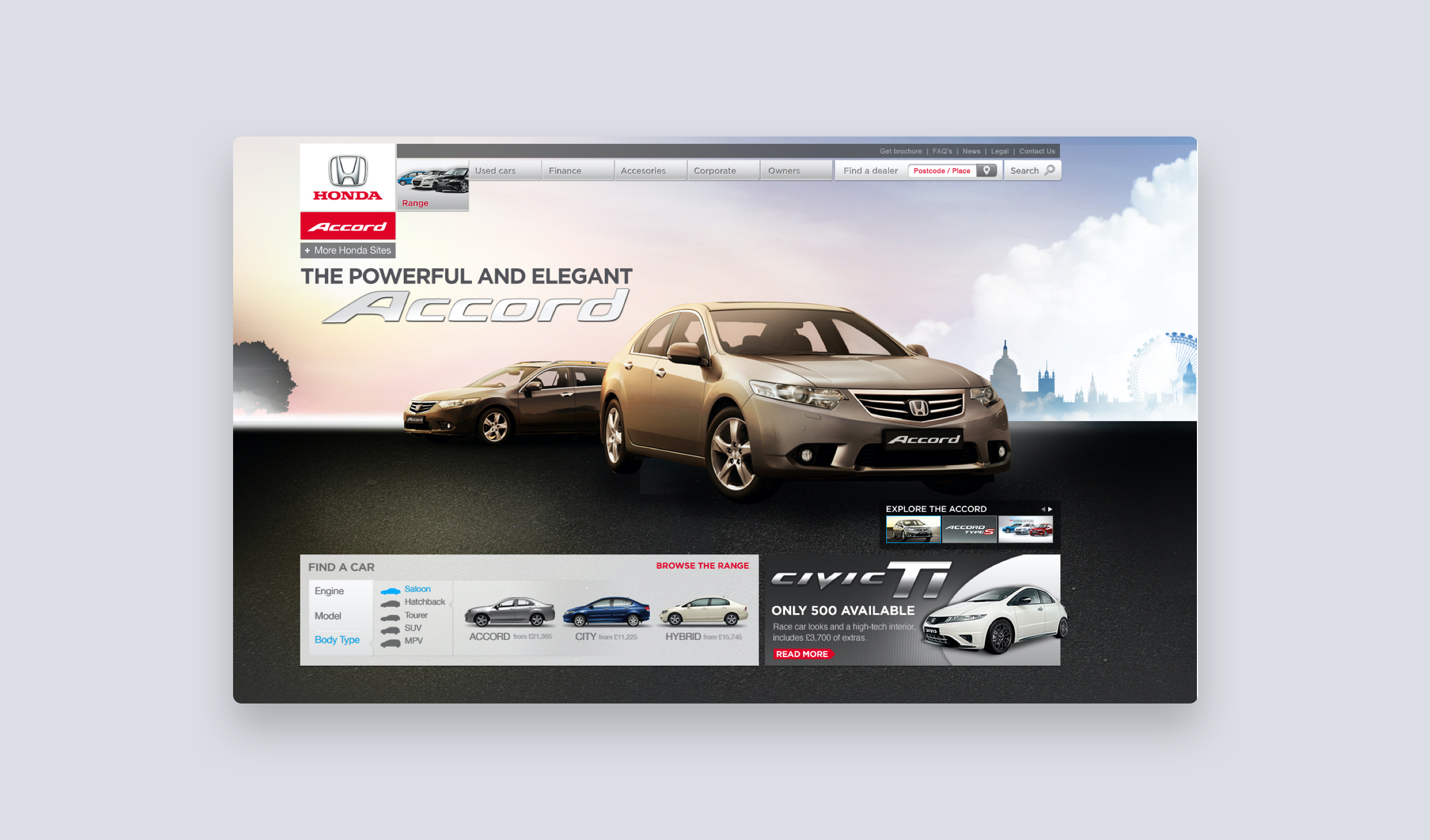
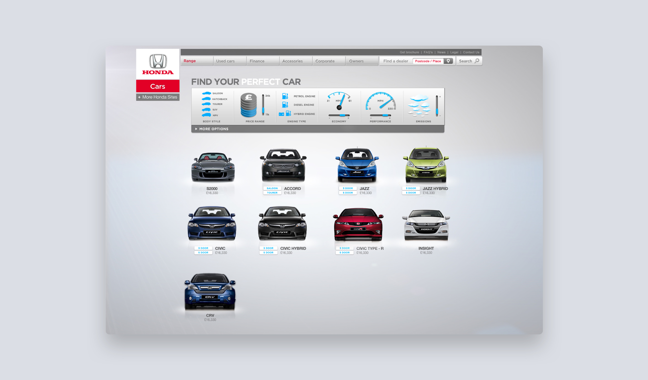
Products screens were designed to reflect the vivid style and character that runs throughout the Honda brand
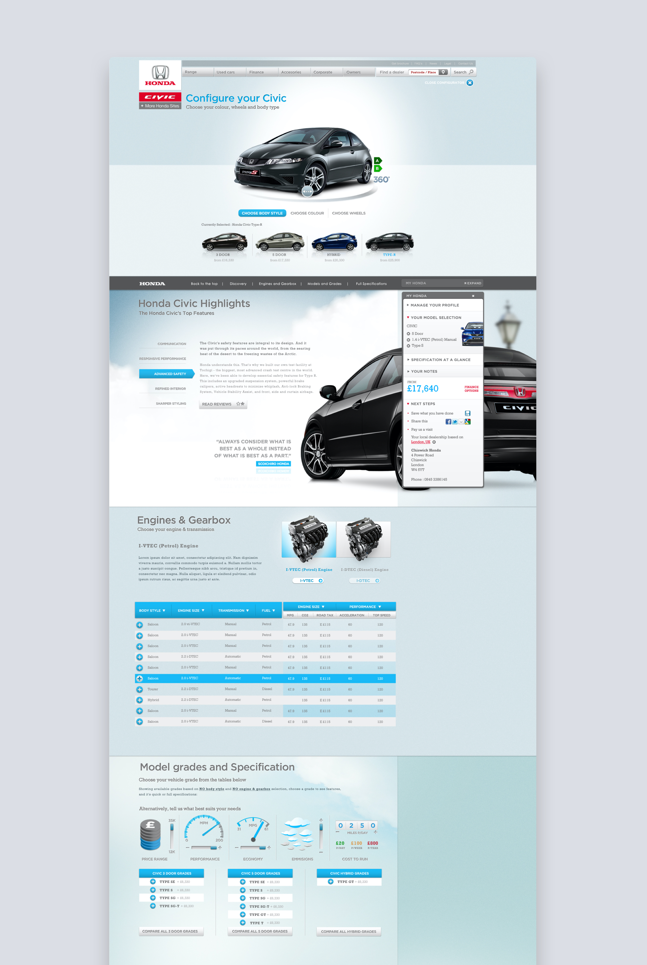
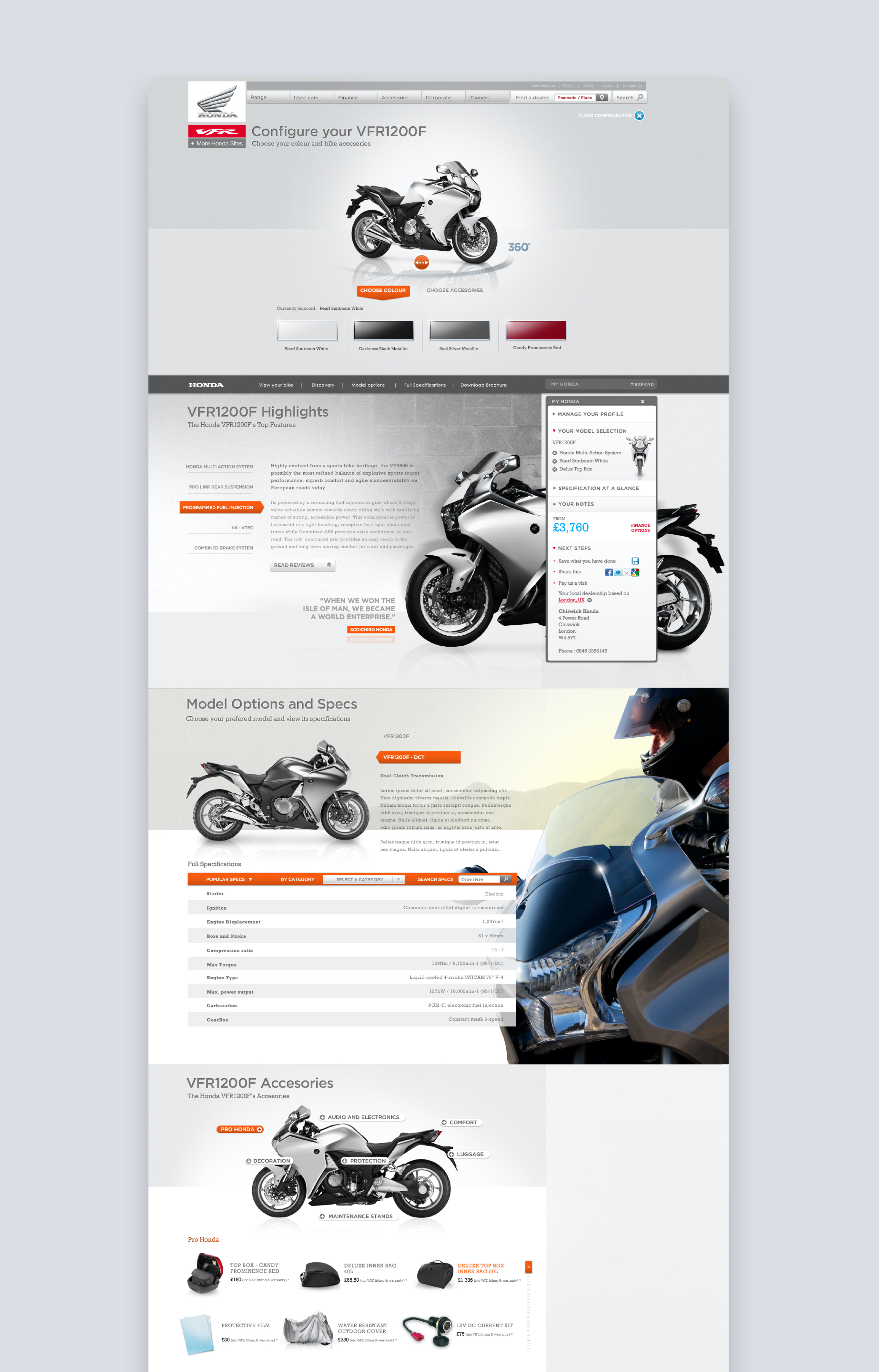
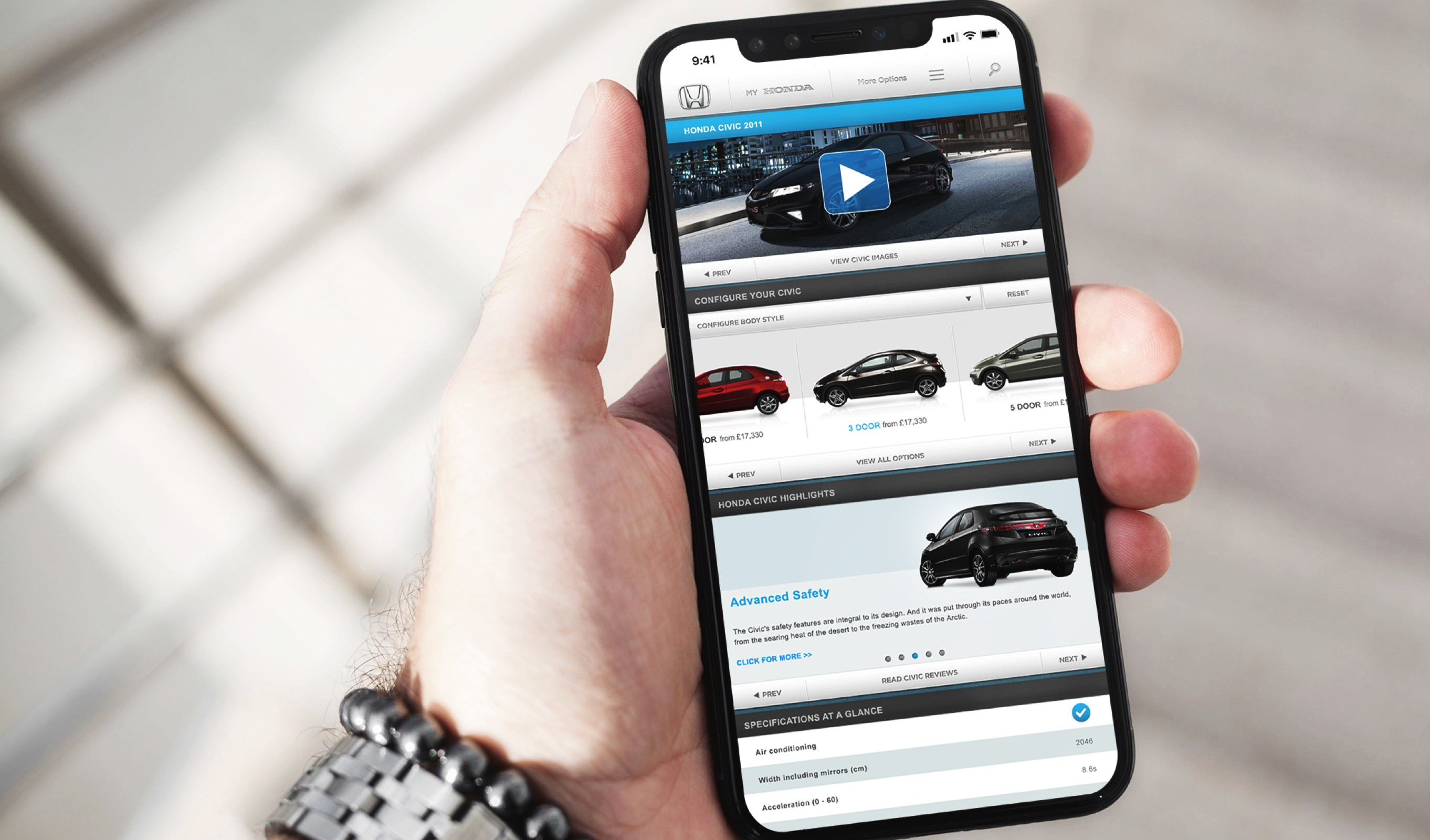
Pages were designed to scale to a fully featured tablet viewport and then scaled to a reduced function version on mobile.
The outcome
A new defininition of the Honda brand for digital, incorporating the unique character and playfullness of the brand while allowing flexibility for the scope of Honda's products.