Pr Shots
Designing a scalable brand management platform
Project overview
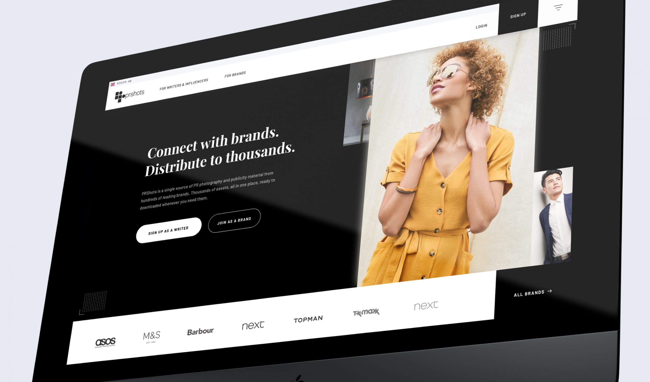
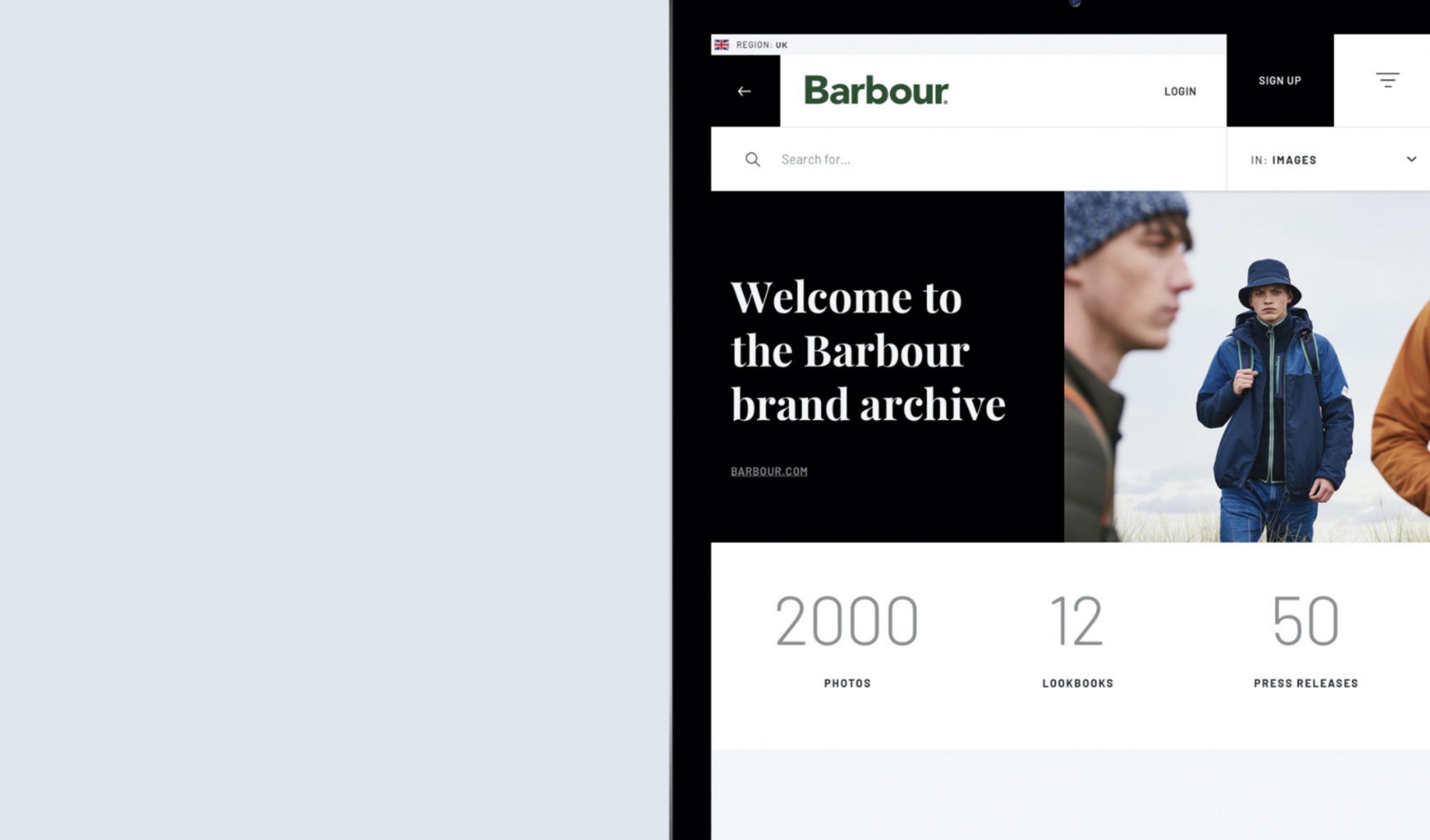
The PR shots platform is a centralised hub for brands to upload and manage their media content and as the go to place for journalists to keep track of the latest brand content, download the latest videos, images and press releases.
Originally built over 10 years ago the platform was in need of an upgrade to make use of the latest technologies, responsive design practices and a more user-centric approach to its design in order to give users a more fluid experience and more efficient service.
Role:
Lead designer throughout end-to-end process: Sketching, wireframes, prototyping, visual design and developer handover docuentation.
The approach
A key consideration for the new platform was to allow an onboarding and sign up path within the experience. This had previously been done by a precurement team.
To achieve this a clear content strategy was needed to make the benefits of the service clear to potential customers and to clearly direct user groups to their respective information areas.
The key to this was to define a new structure to the site which incorporated a "storefront" area as a default site for non members. This would act as a consumer facing brochure site to inform users and direct them towards one of the two sign up paths.
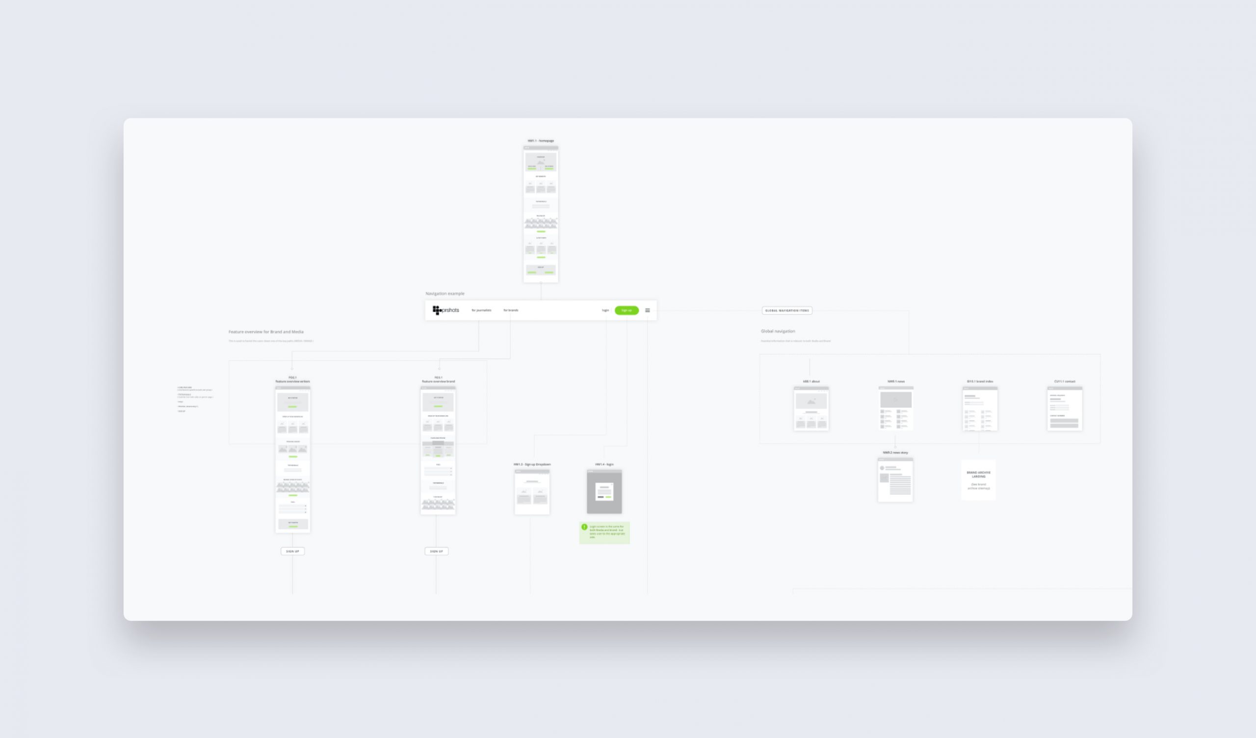
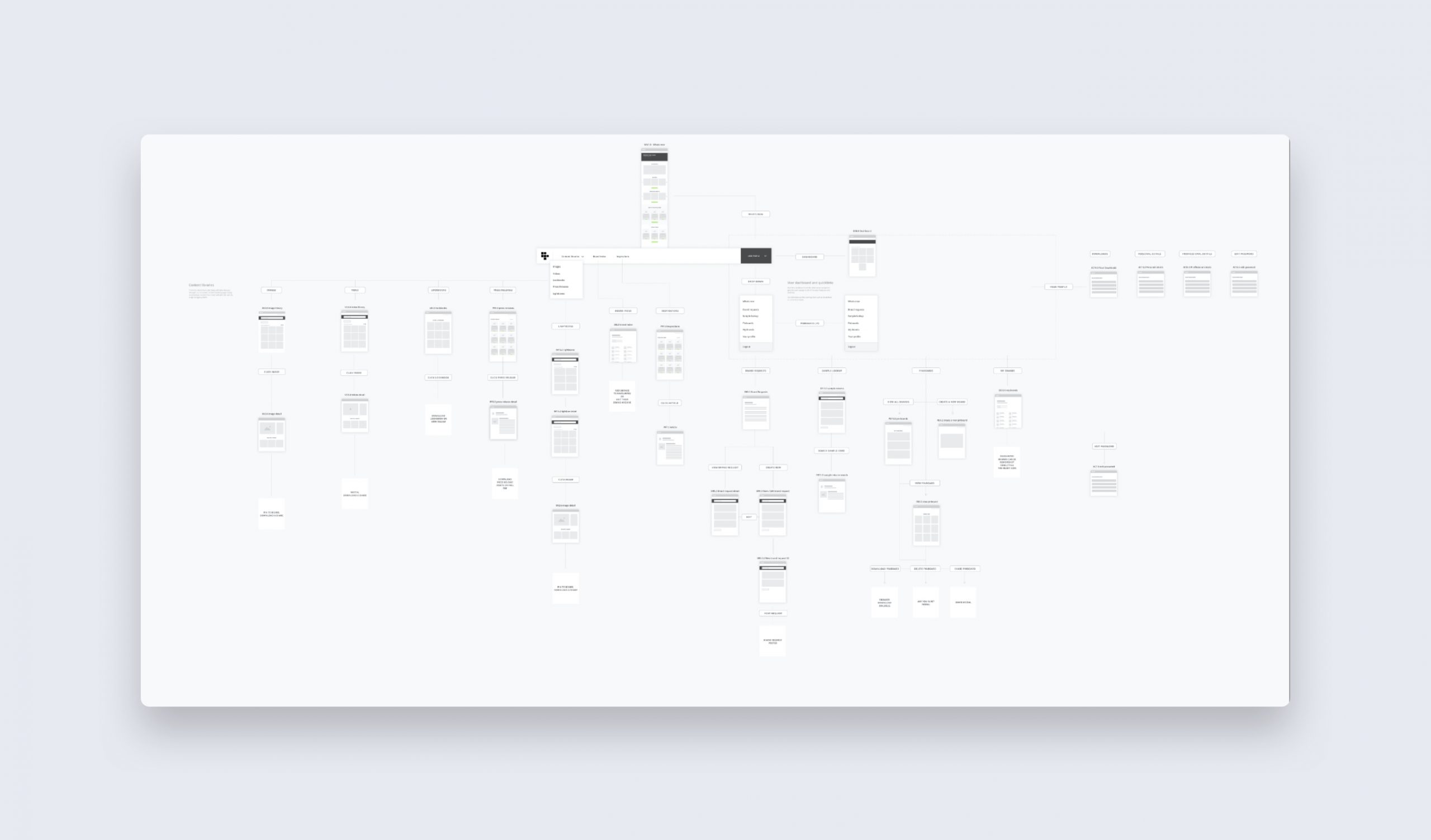
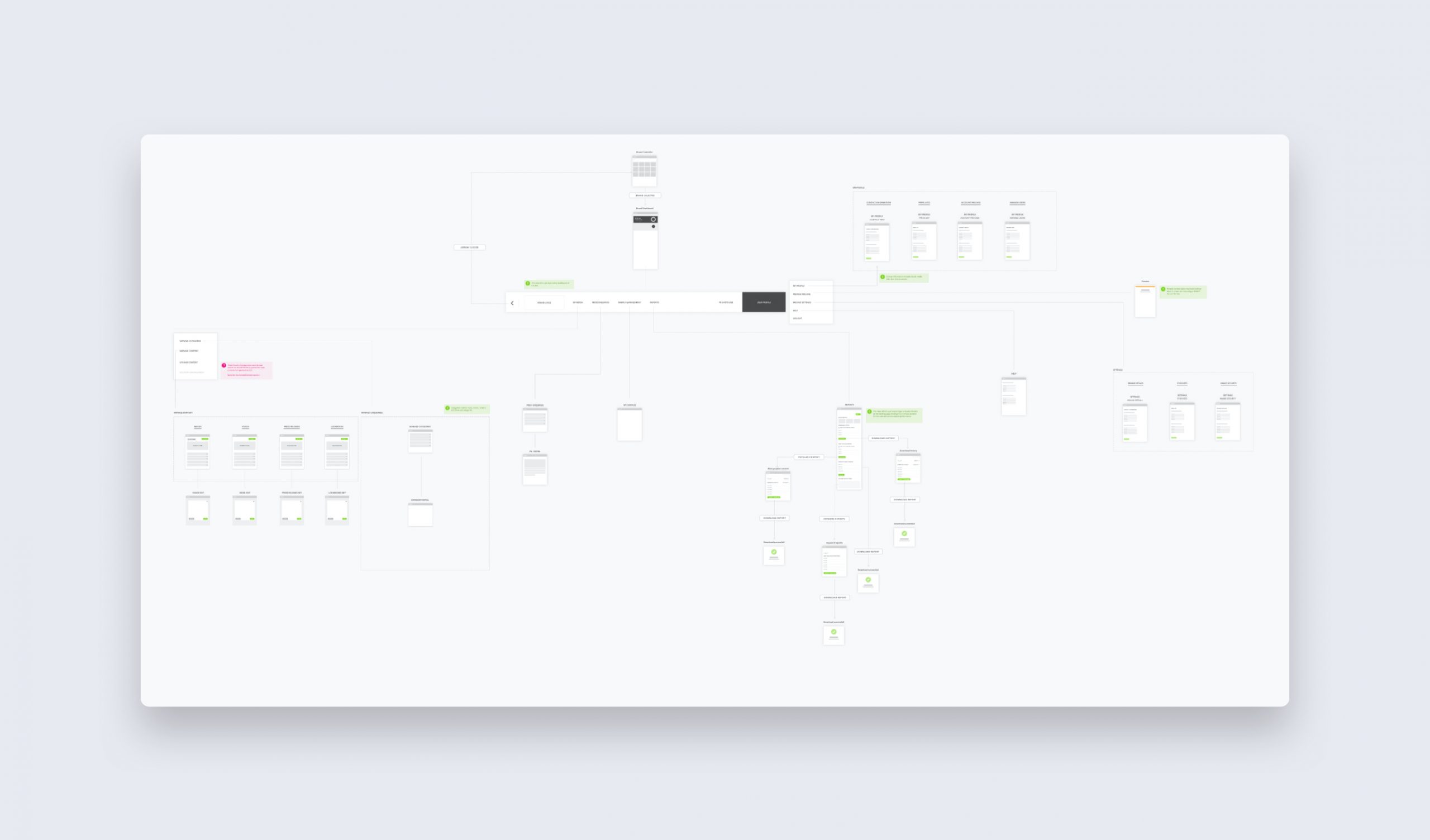
Detailed sitemaps were created for each of the 3 areas to help define the scope of the project and how best to structure the content.
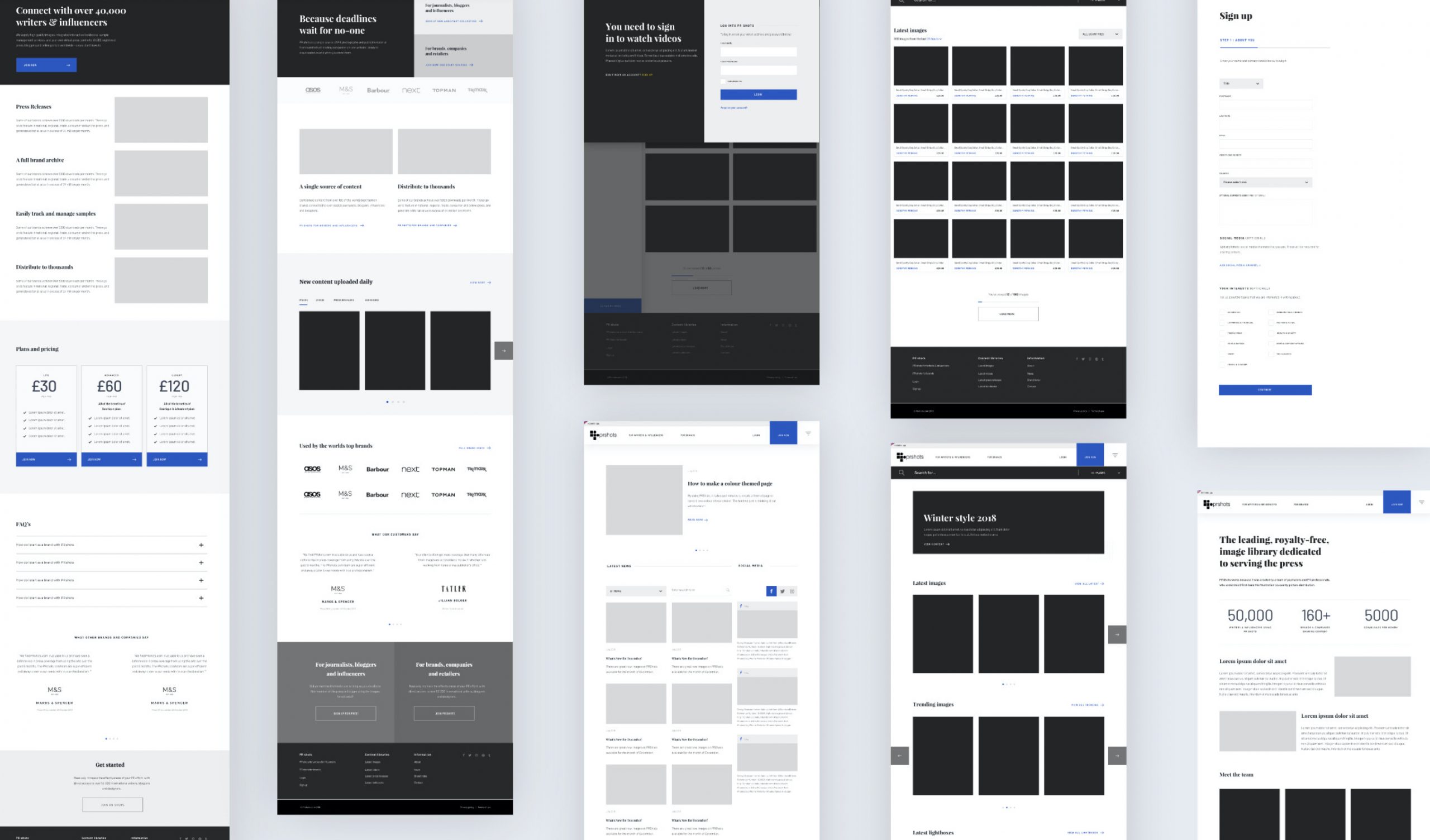
Medium fidelity wireframes and motion prototypes were used to define key functionality.
Visual design process
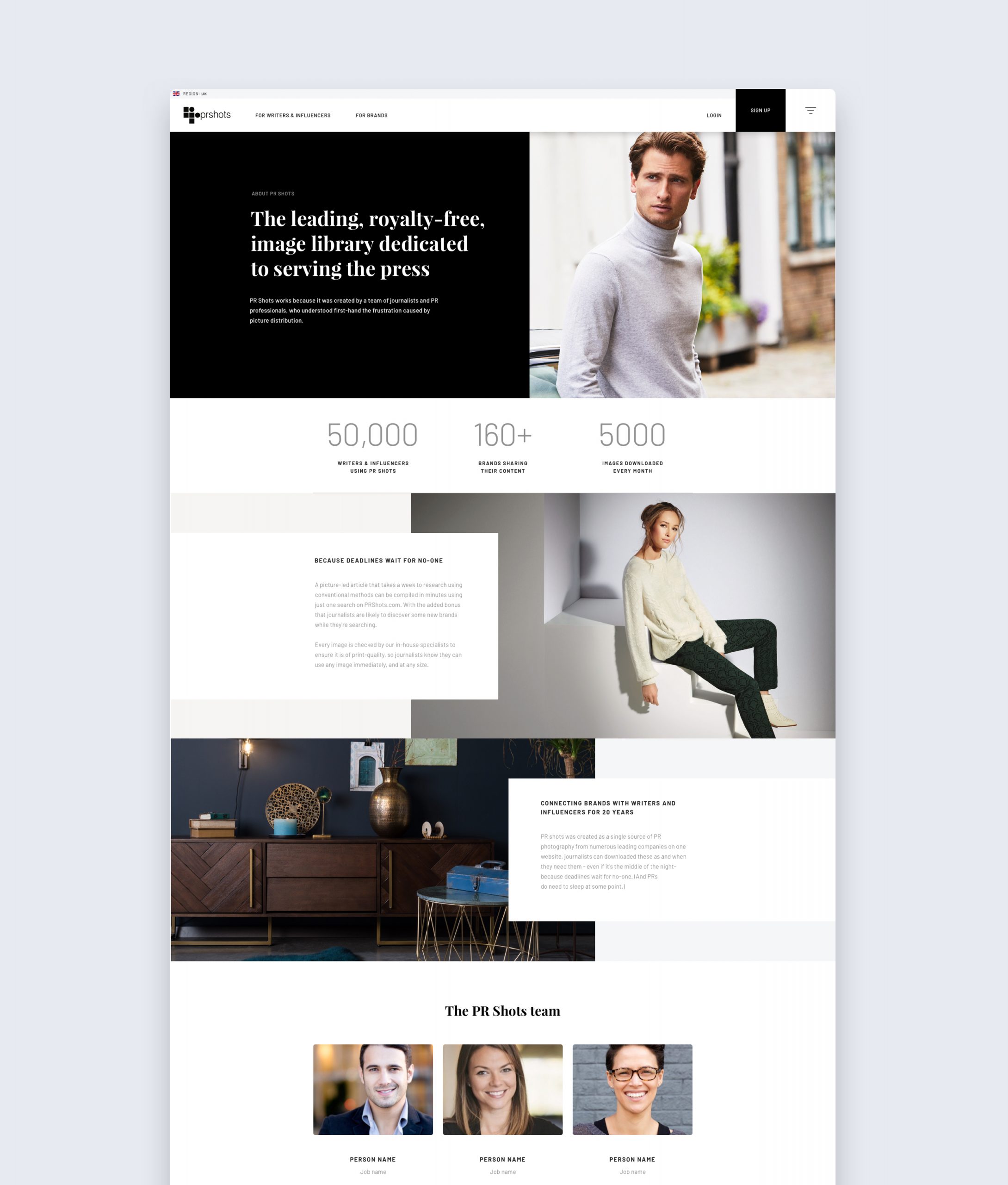
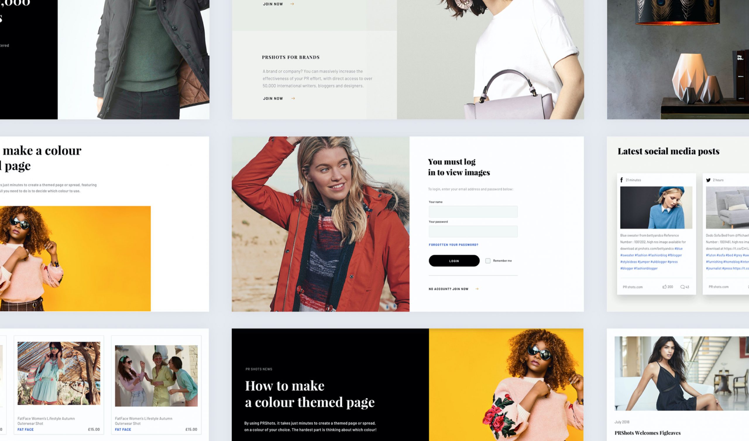
Alongside the updated structure and behavioral design, the visual language also needed an extensive revision. With most of their customers within the style and fashion industry. The requirement was to make full use of modern web technology to upscale the visual fidelity, bringing it more inline with the level their customers were used to seeing.
A stark, largely monochrome, palette was used throughout in order to give priority to the high quality brand photography avialable on the platform. This coupled with the bold typography gave the platform an editorial tone to reflect the journalistic aspect of the platforms use and help foster an affinity with the user base.
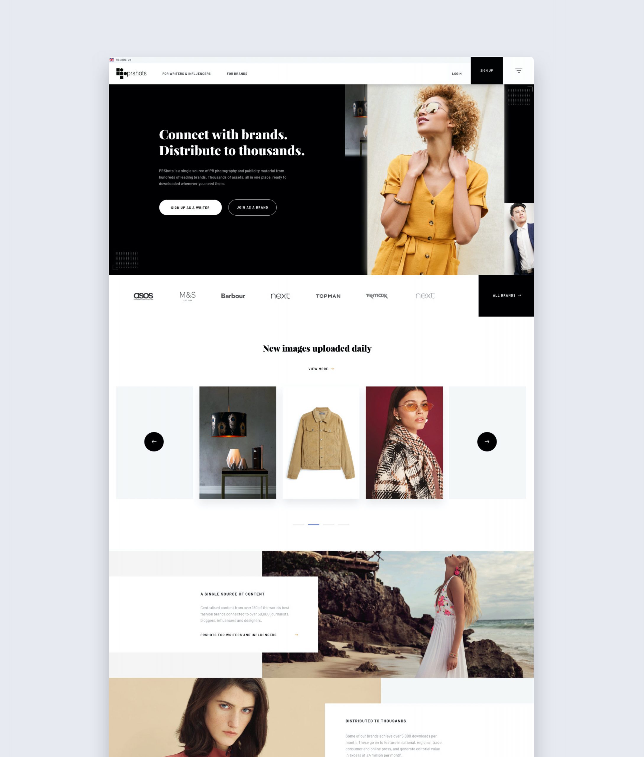
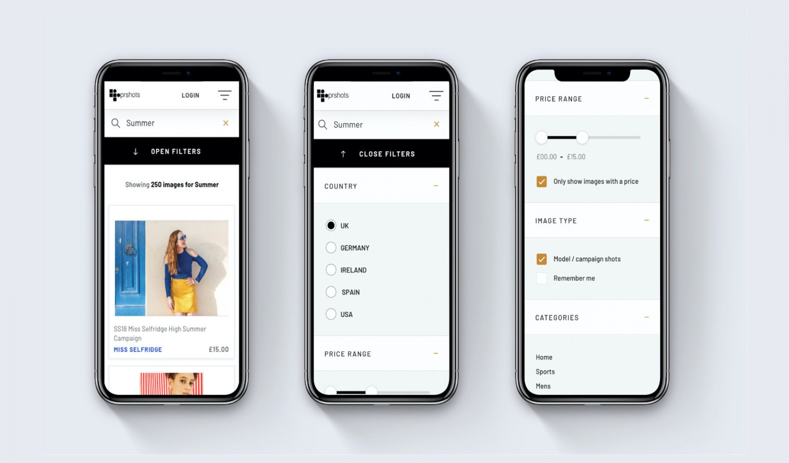
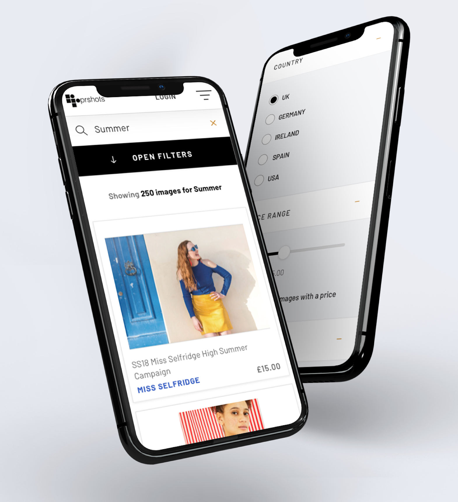
It was essential that the platform also be scalable for use on smaller screen devices for work on the move.
The handover
A detailed design and behaviours document was created to aid in the handover to development. Used as a reference point for build, the documentation meticulously detailed the use of grids, spacing, layout and stylistic elements to ensure that the offshore engineers had everything that they need to build a platform that could be scaled in future iterations.
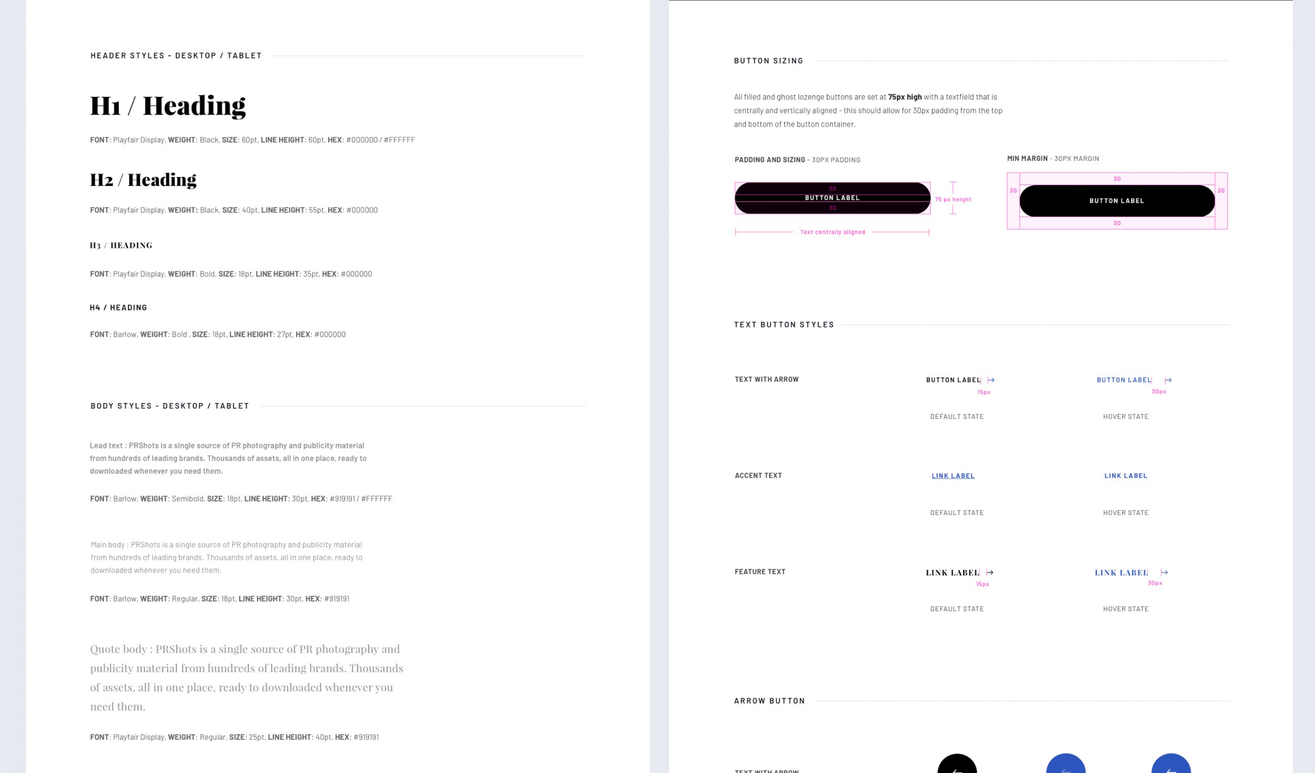
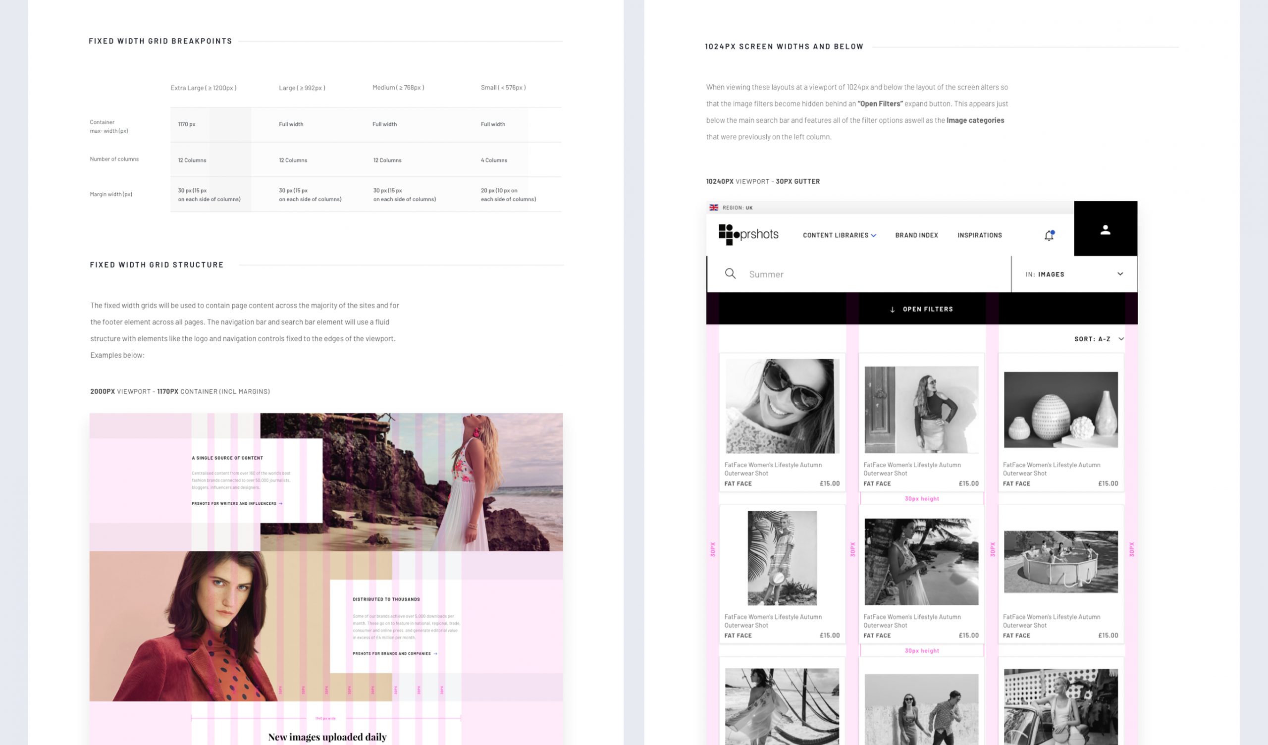
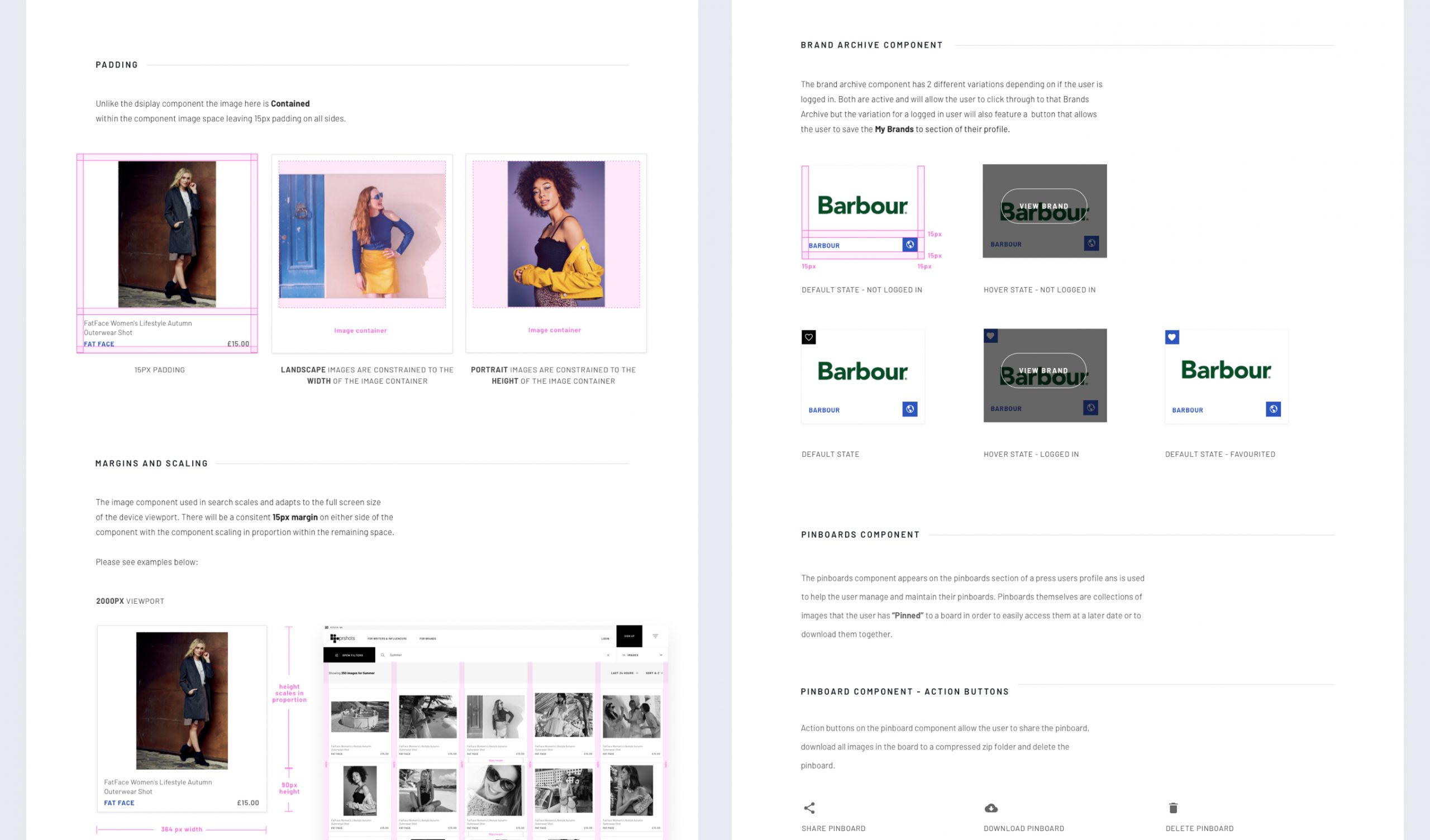
The handover documentation outlined key stylisitic elements, feature exmplanation, grid implementation and component behaviours to expedite the build process.
The outcome
A refined web platform which would benefit existing customers while attracting new customers with its refined user experience and updated approach to UI and visuals.