Close Brothers
A new brand direction, redefined for digital
Project overview
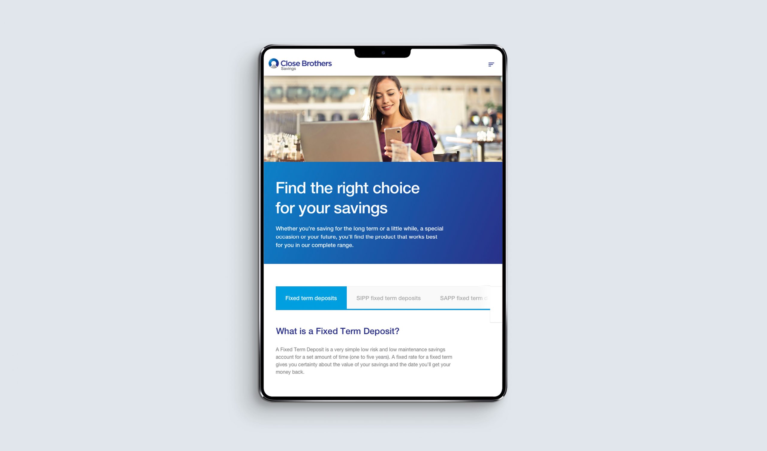
Close Brothers is the leading merchant banking group in the UK providing lending, deposit taking, wealth management services and securities trading.
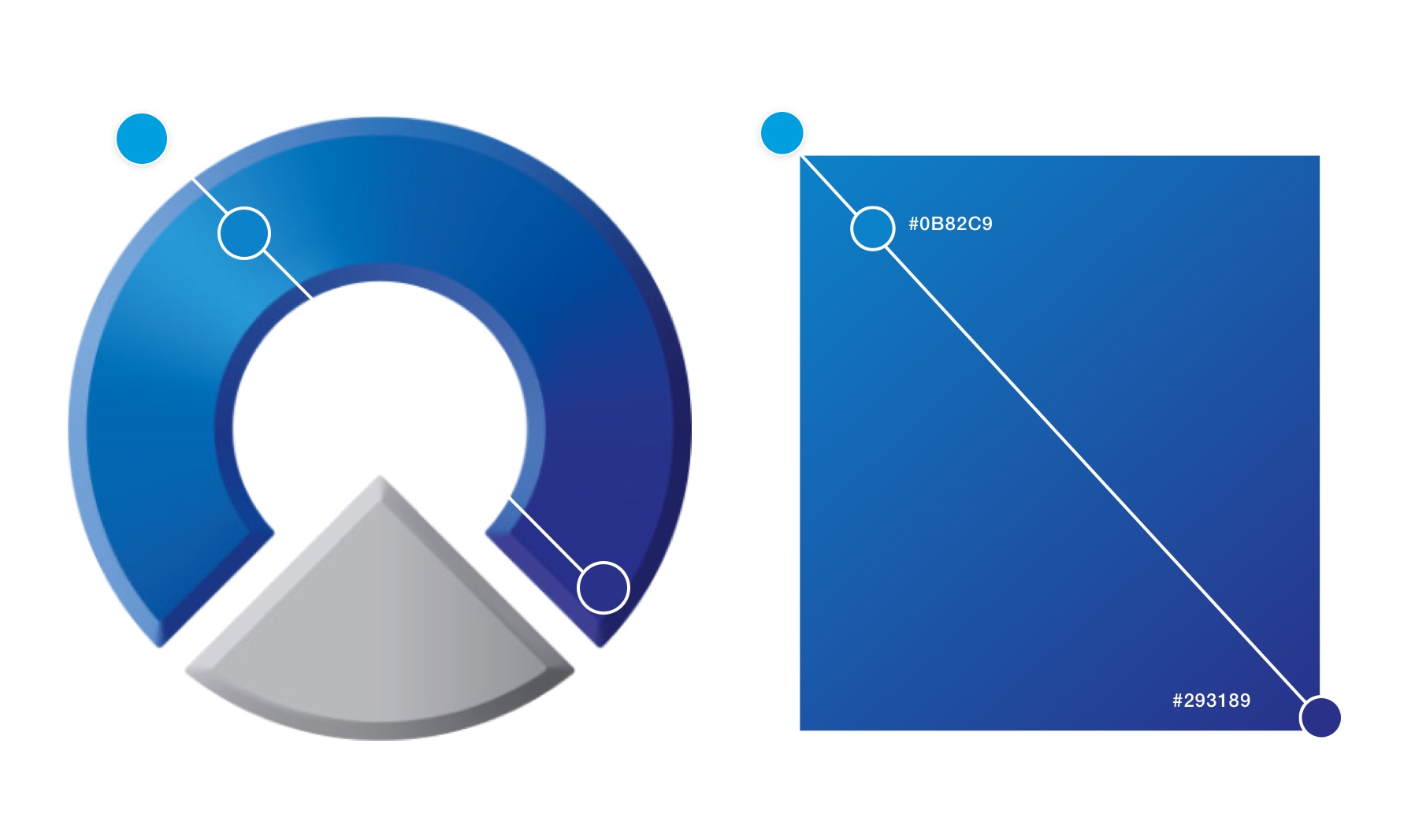
After a redesign of their corporate identity and core visual language the organisation required an update to their customer facing online presence. Spearheading this new visual direction was a project to overhaul the site for one of their key business units.
The outcome of this would form the basis for a new UI design system to be adopted by the company as a whole in future digital products.
Role:
Lead visual and UI designer : interpreting the new brand guidelines and adapting these to a new digital design language.
The approach
Though a well established organisation in the UK. Close Brothers had only recently begun to realise the value of their digital presence. For that reason many of their business sites had become inconsistent with no single source of truth for design and development teams to follow.
The introduction of the new brand system was a great opportunity to audit current design practices and build upon them to lay the foundations for a consolidated design system.
An audit of current Close Brothers websites highlighted a list of components needing refinement to meet the new brand direction (drag handles left/right for before and after).

Developing a visual language
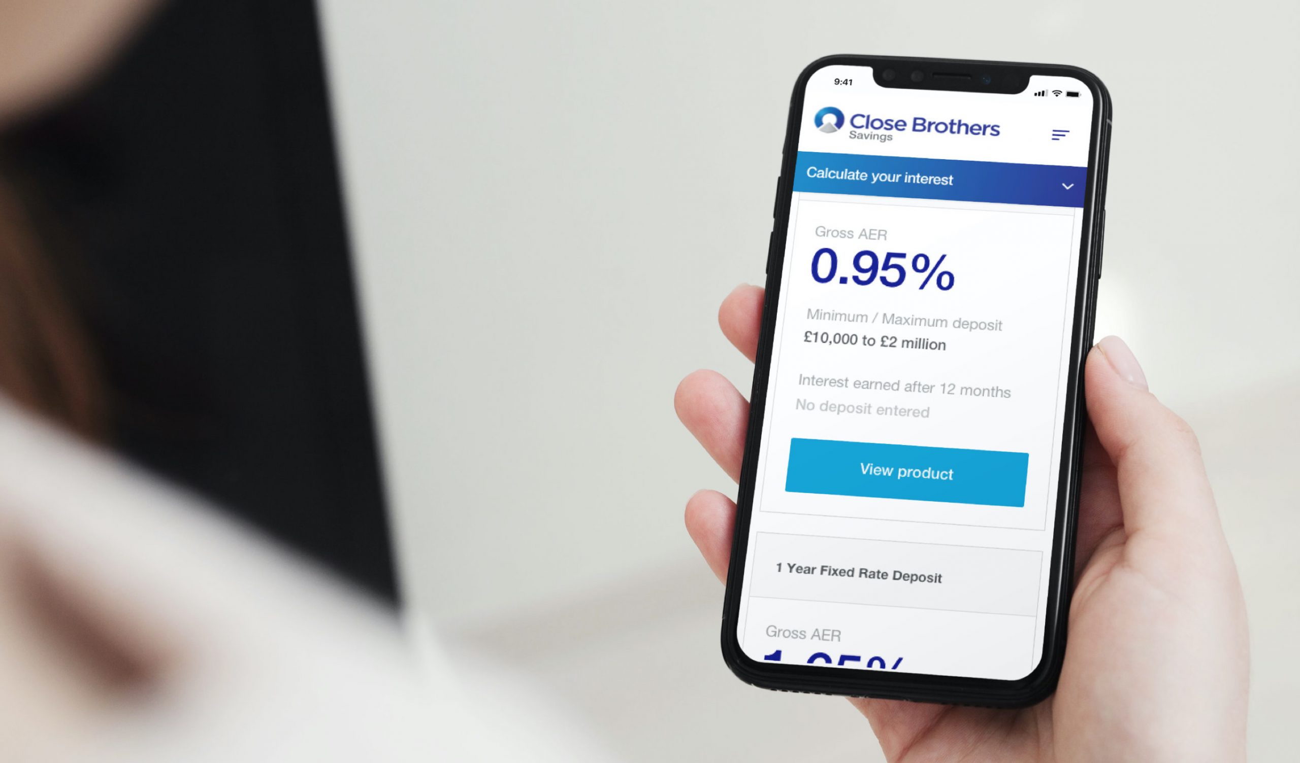
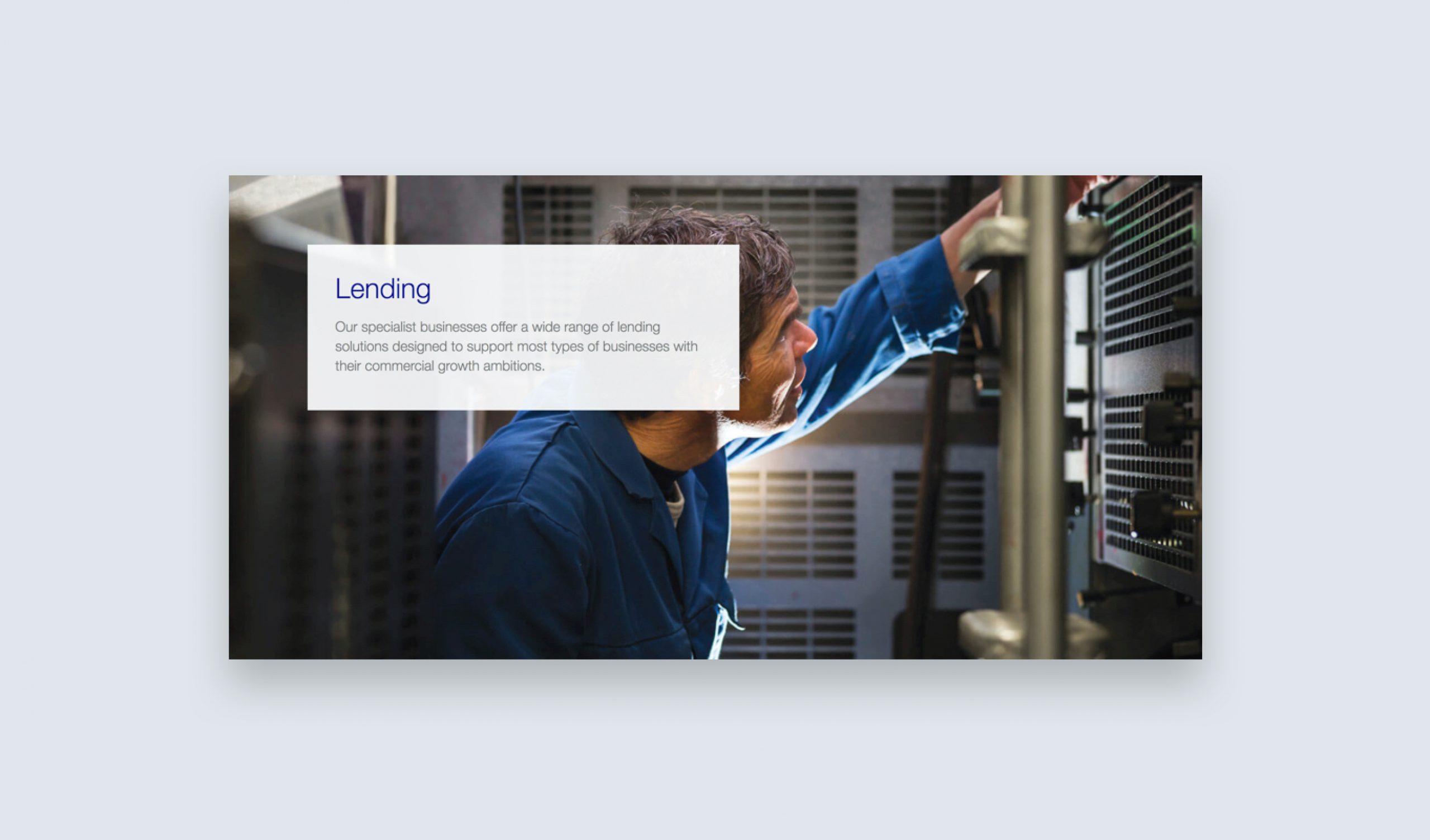
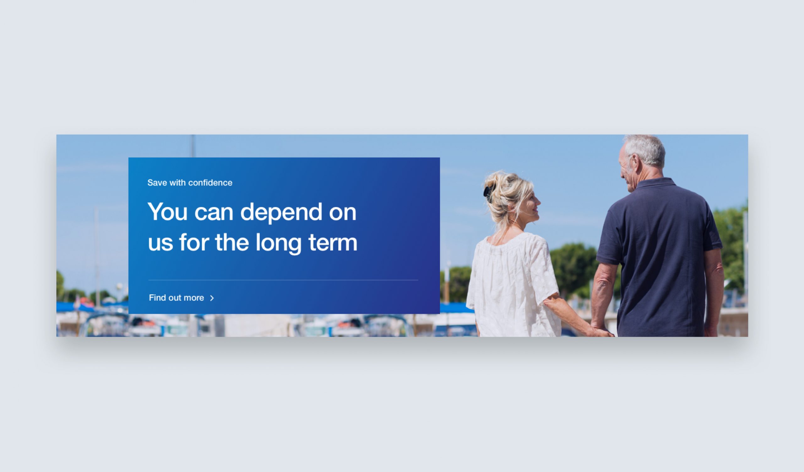
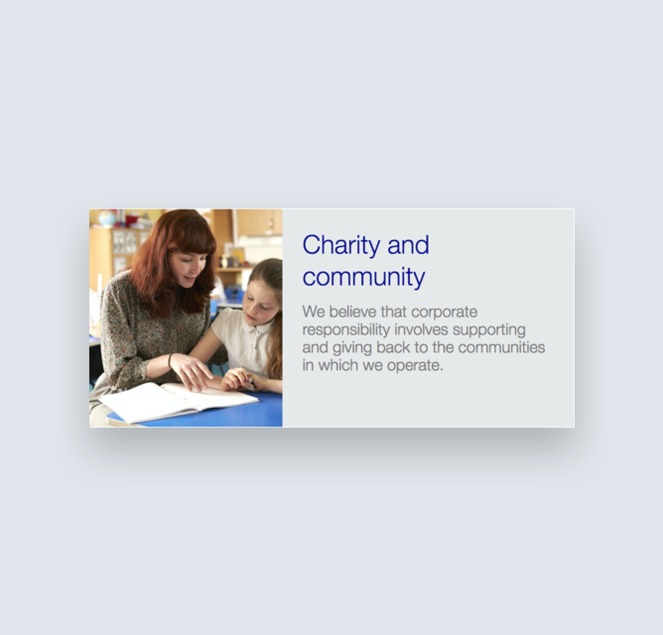
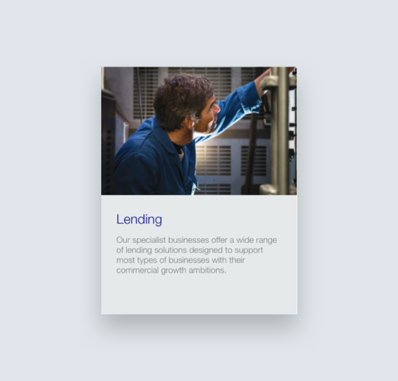
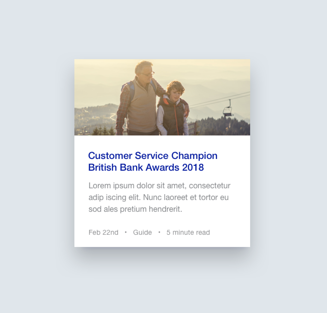
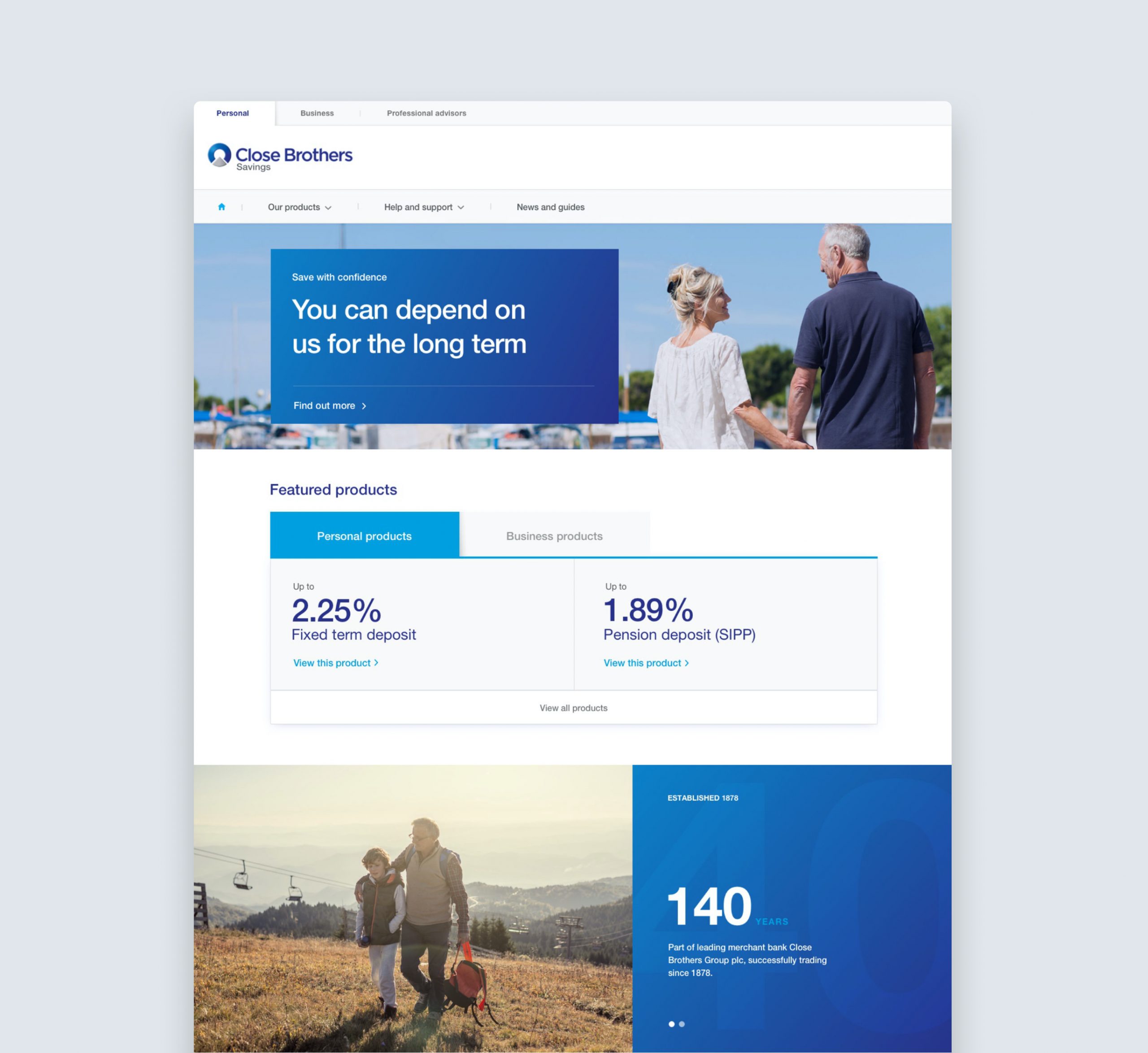
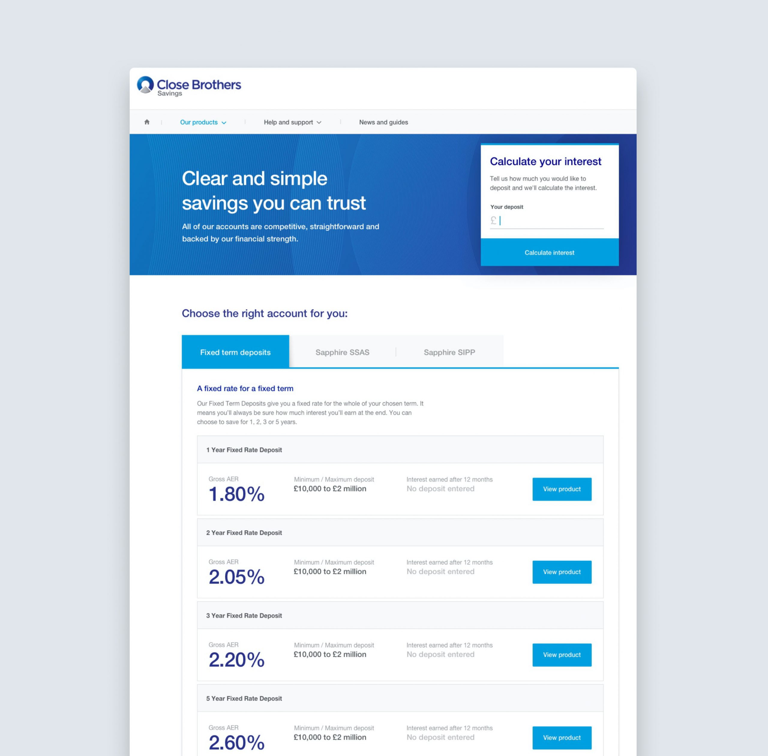
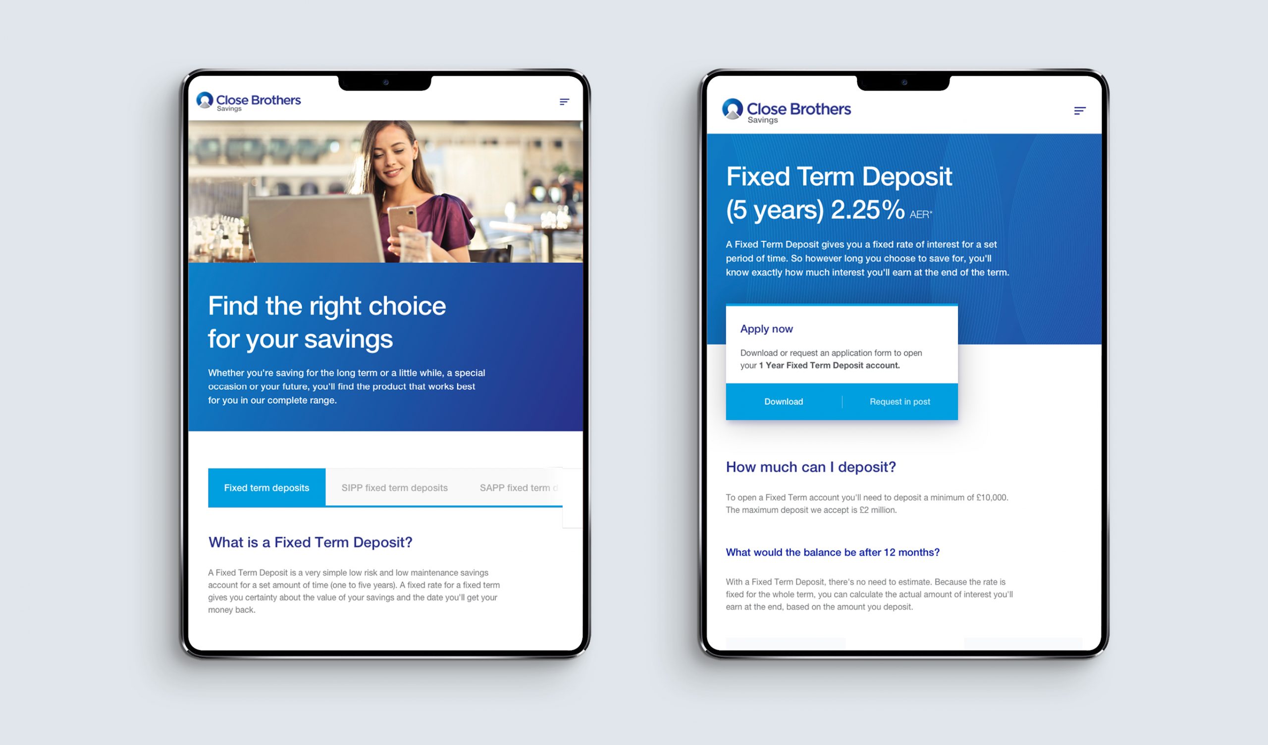
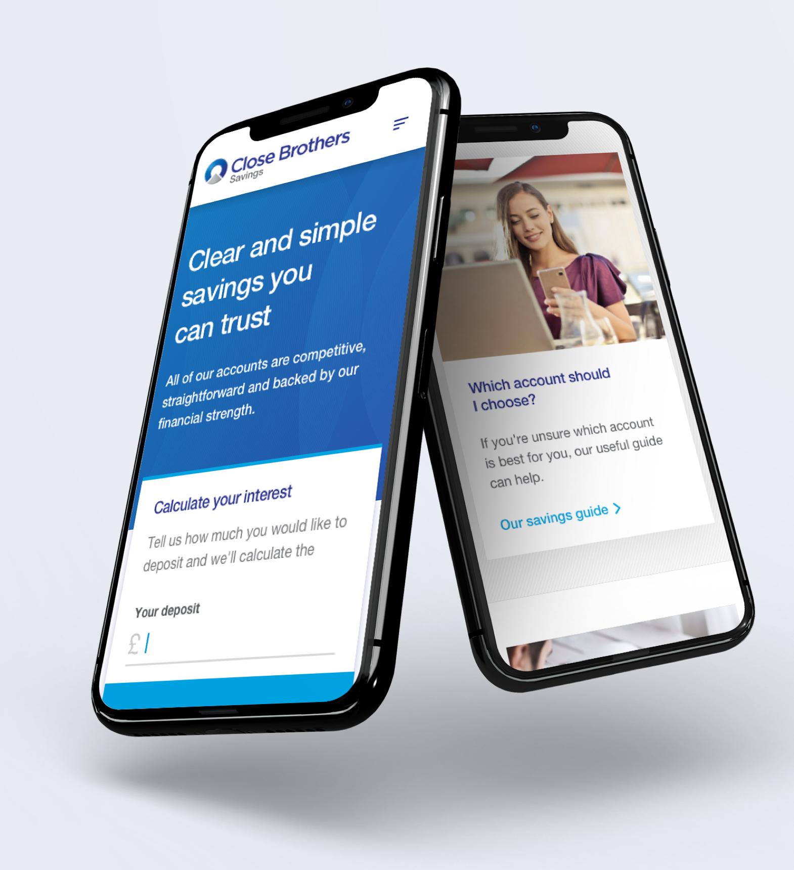
Solutions developed during the design audit were expanded across a full site design to evaluate the new UI style in context and how it could be applied to live content.
Building on the brand redesign, the new direction aimed to soften the more corporate aspects of the current style. Incorporating a more nuanced approach to type typography, depth, spacing and microinteractions to help create an approachable, credible and distinguished new aesthetic.
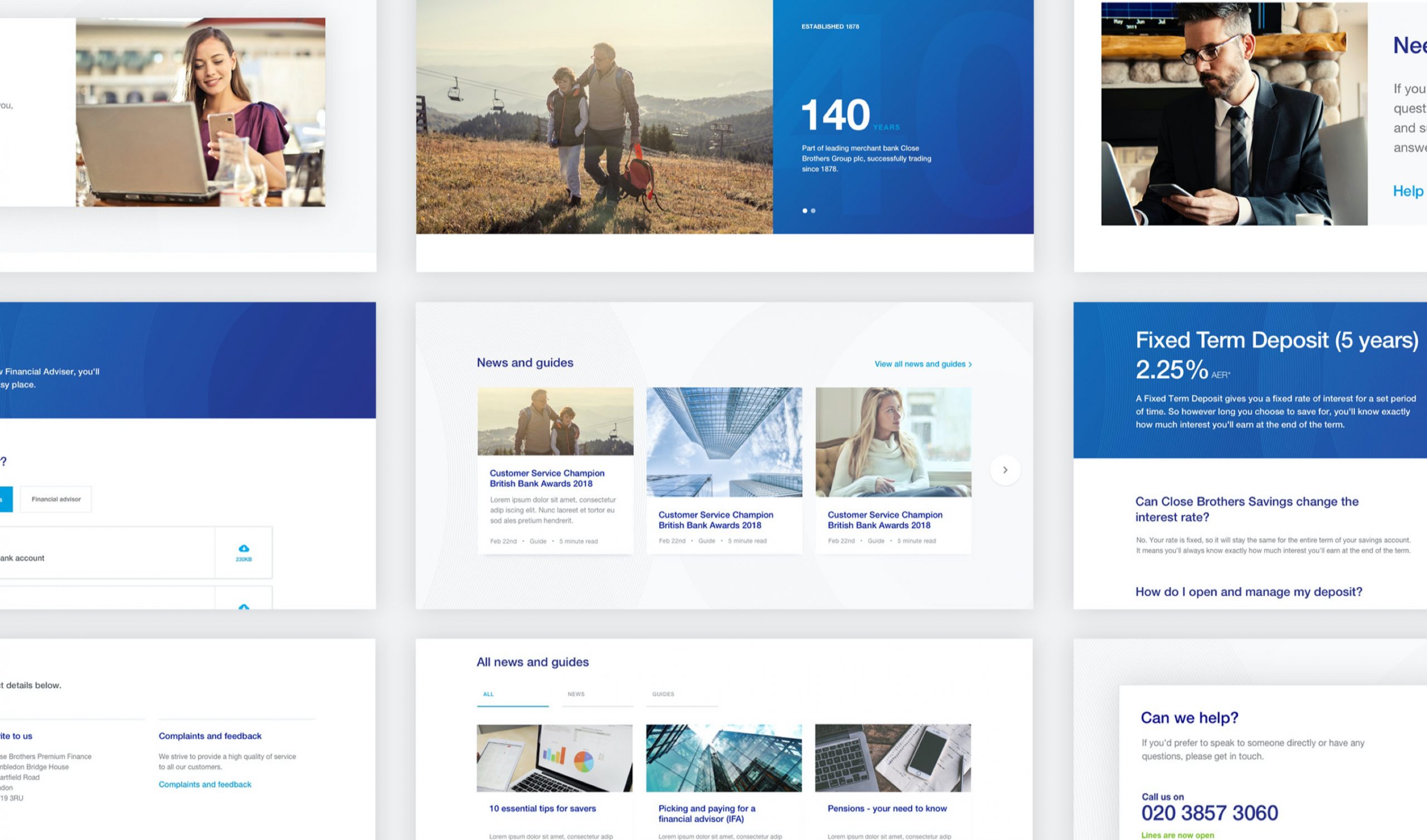
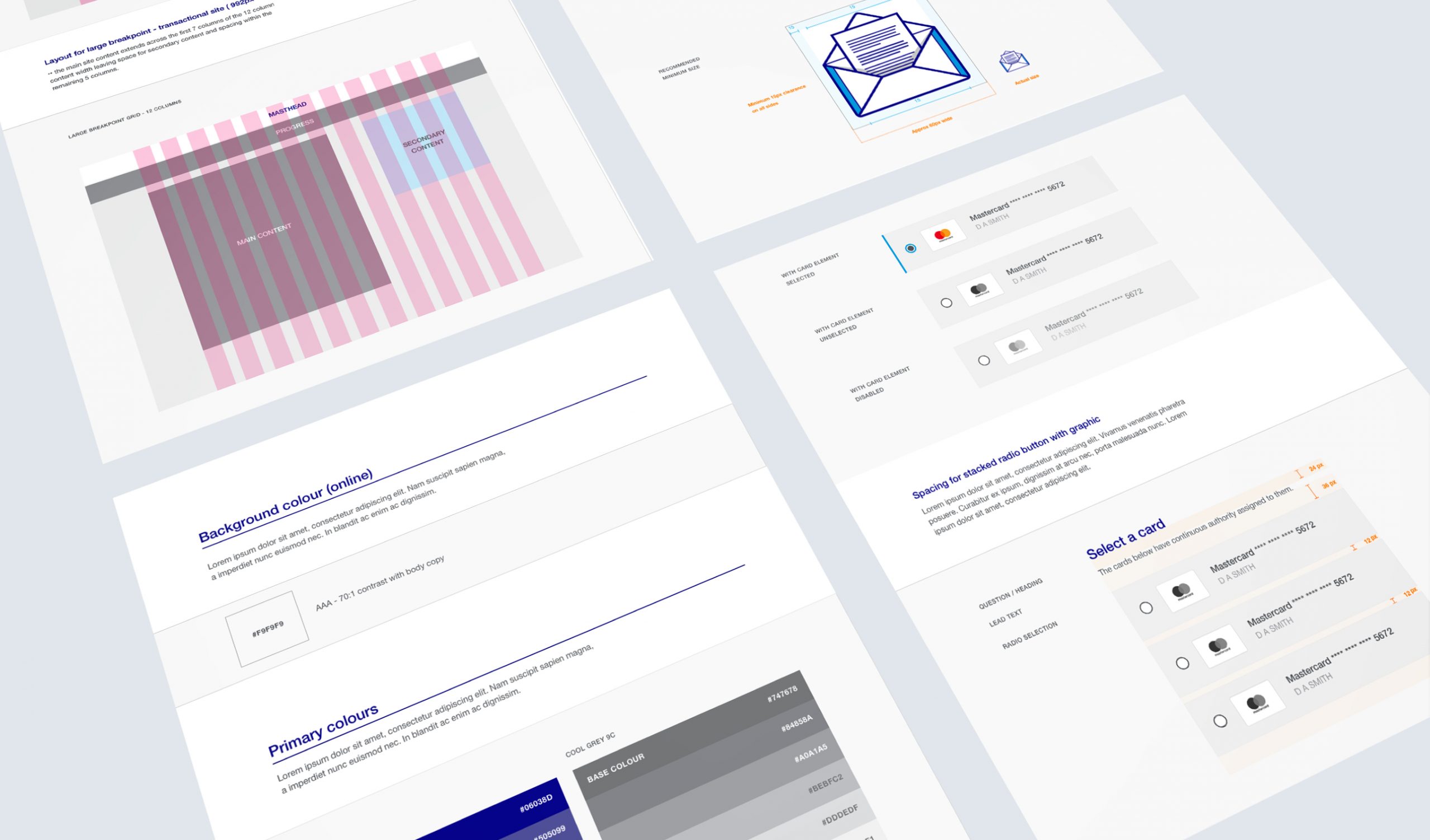
Design guidelines
Component libraries, styleguides, component behaviours and spotlight features were carefully detailed to create a scalable and modular design system which could be applied across the breadth of the banks services from transactional to retail.
The outcome
A fresh take on an established brand helped to bring a customer facing site a much needed overhaul while also planting the seed of a fledgling design system which has since been built on and developed in subsequent years.