Fremantle
Redefining a brand for a unique digital experience
Project overview
Fremantle make and sell some of the world’s most loved television across the world. After a renaming in 2018 they have gone through an extensive rebrand to put the creative content that they distribute at the forefront.
Previously their online presence did little to reflect the creativity and scope of the organisation. During the redesign and build of their customer facing, group site, they wanted to push the boundaries of their online brand into new areas for a unique digital experience.
Role:
Lead design and art direction: wireframing, creating motion concepts, visual design and developer handover documentation.
The problem
Fremantle is a creative company far more than a corporate, so the visual and technical aspects of the site needed to demonstrate that. The initial brief outlined the need for a very dynamic and creatively led site. Not just from a visual standpoint but also how content structure, micro interactions and movement could create a more engaging experience for users.
Initial exploration used wireframes and moving prototypes to help validate unique methods of delivering content to users.
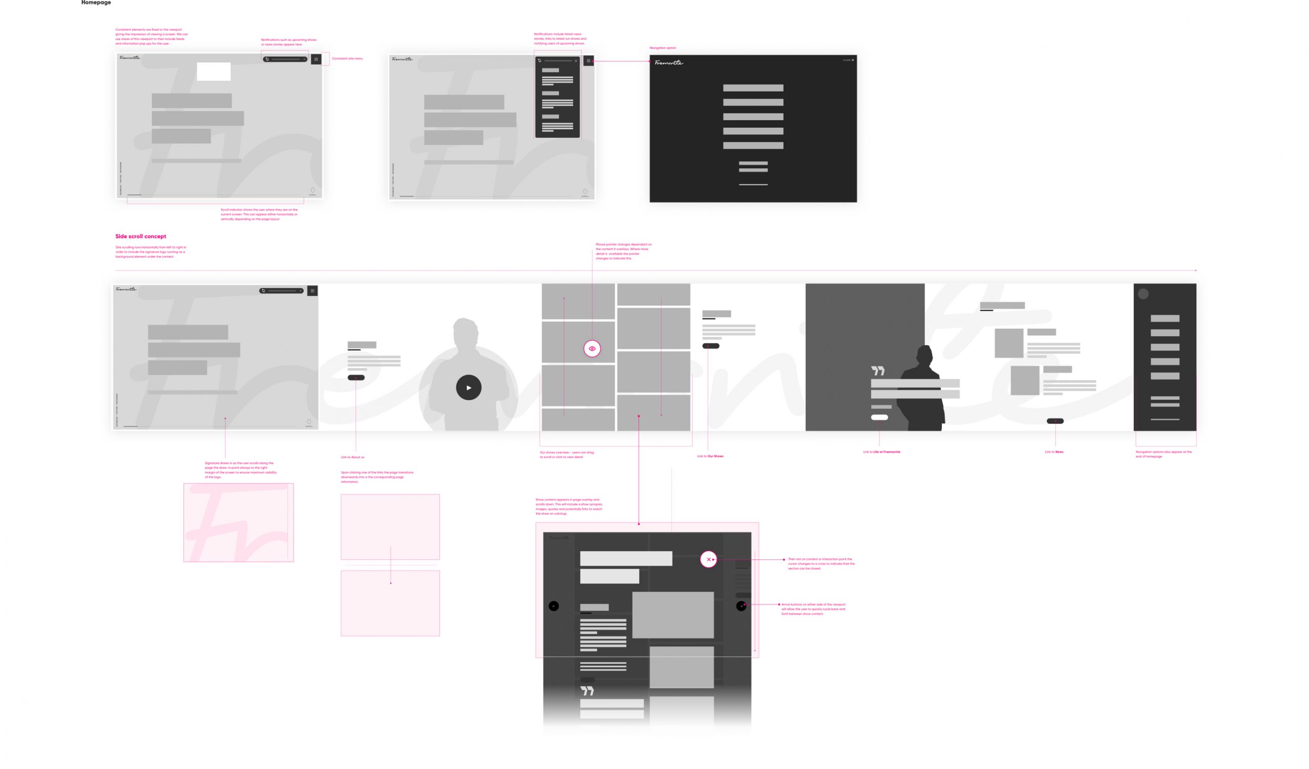
Initial concepts explored the idea of a horizontally scrolling site - making best use of Fremantle's unique signature logo.
A later concept looked at removing scrolling altogether to feature content that would load into a single viewport with constantly accessible navigation links.
The refined concept
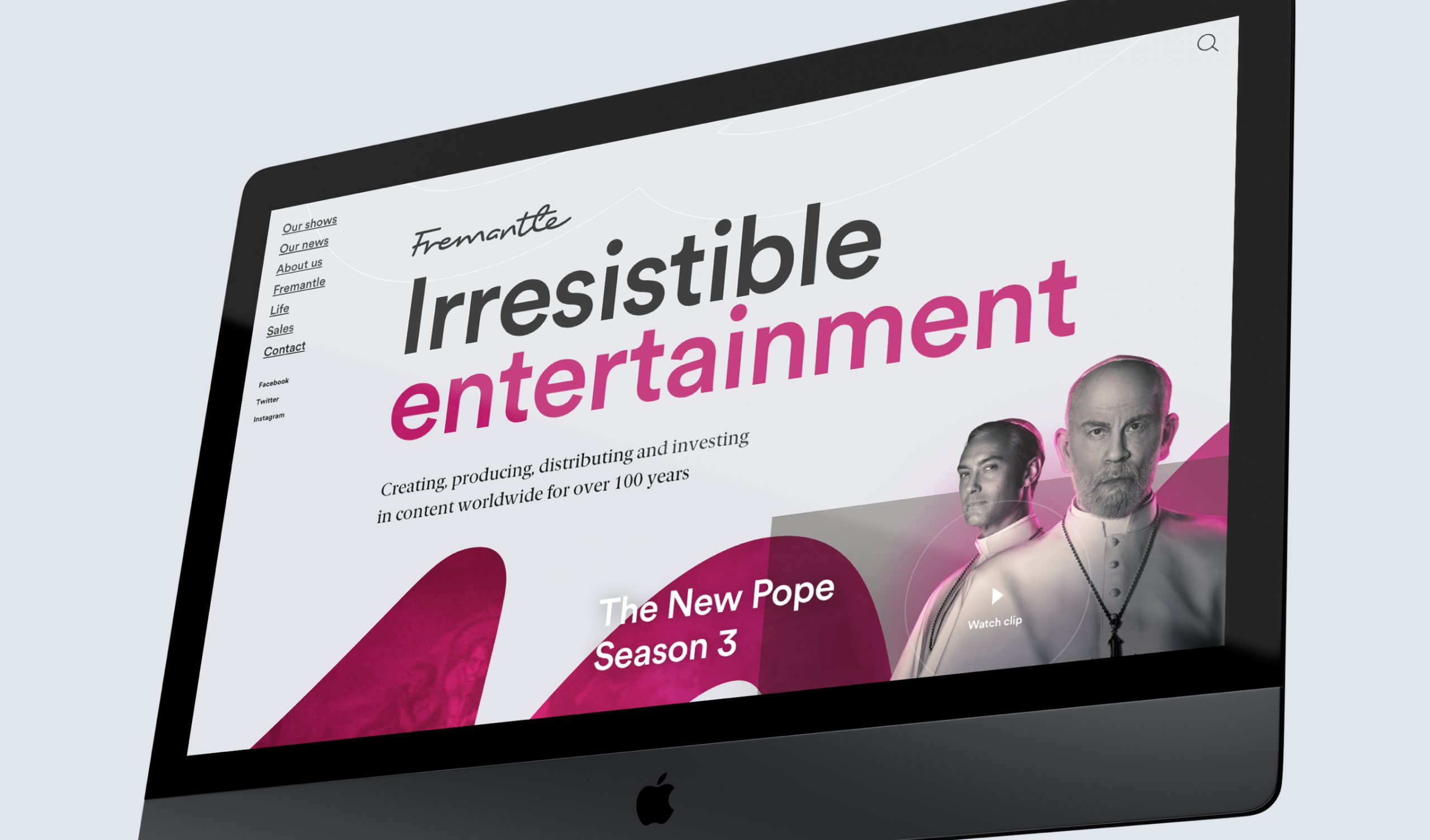
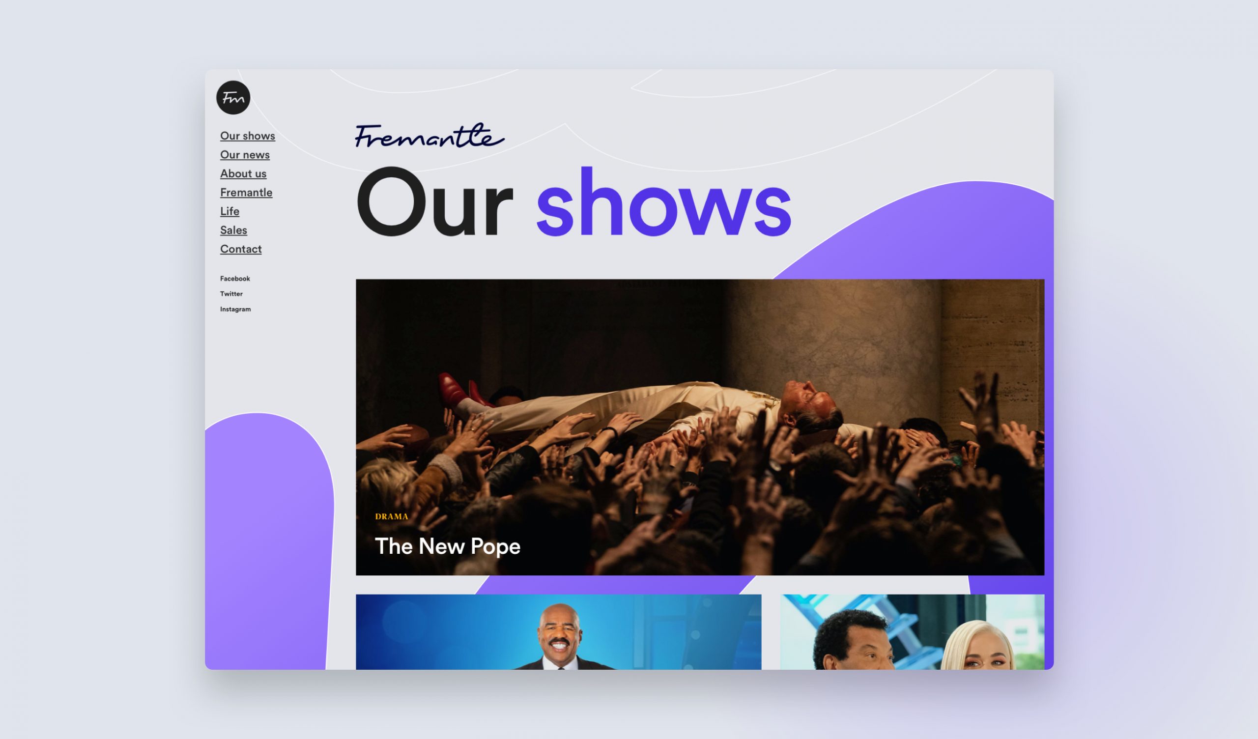
The settled upon approach to the site was distilled down to a more traditional format while retaining the ideas of live content, engaging movement and accessible navigation.
The next step was to explore an updated visual language to accompany this new concept. With a focus on keeping Fremantle's shows at centre stage a restrained direction was applied to the UI with minimal use of colour, brand elements and a focus on bold and impactful typography.
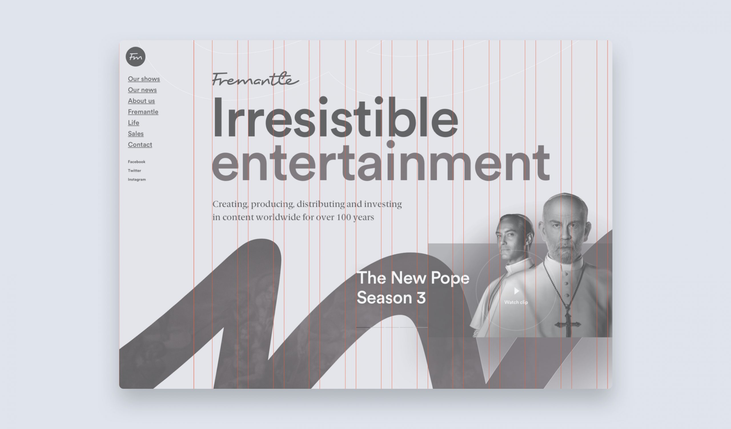
An off centered grid was used to create a channel for the navigation on the left side of the viewport allowing for a consistently accessbile navigation without taking up vital vertical real estate
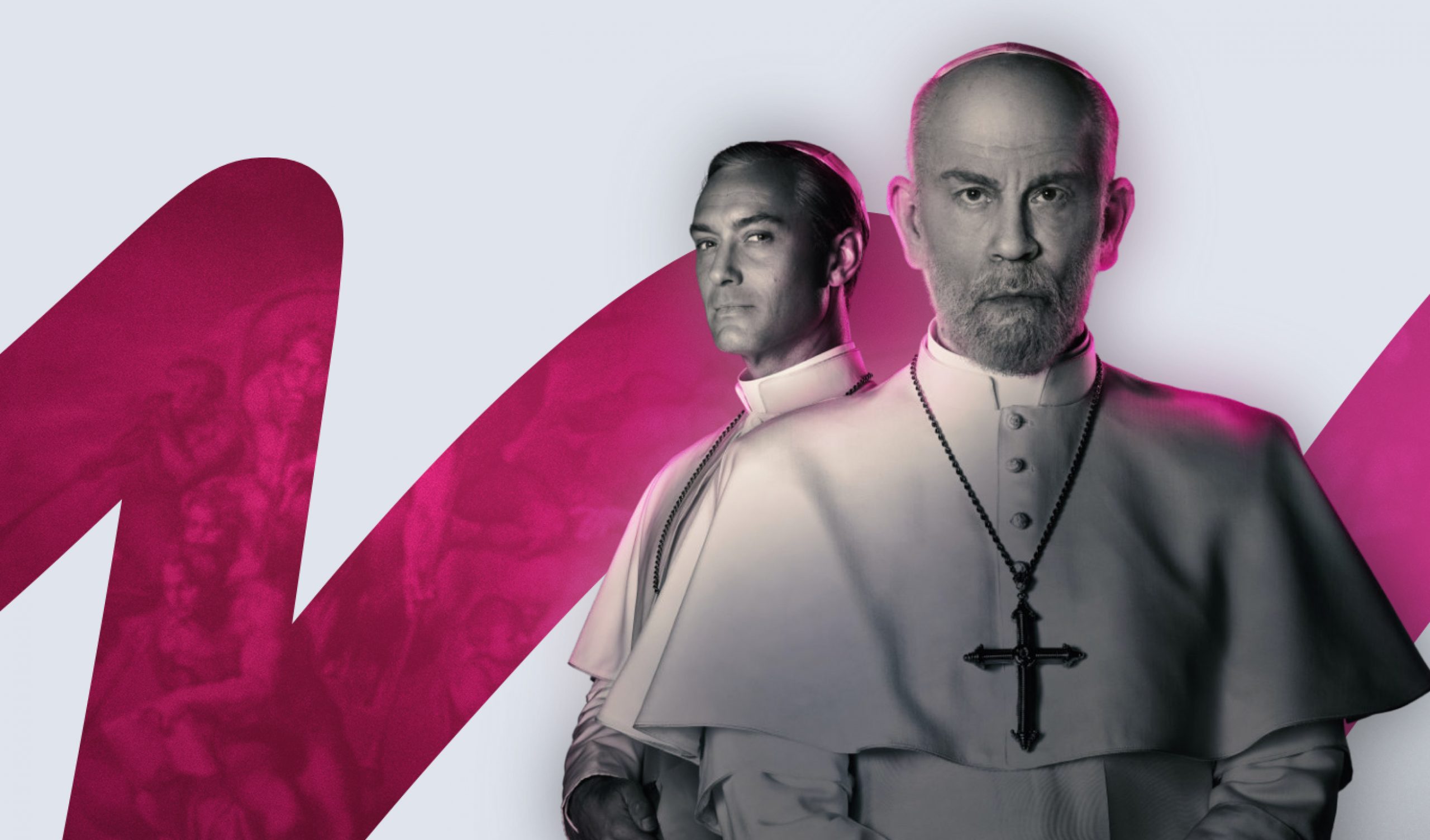
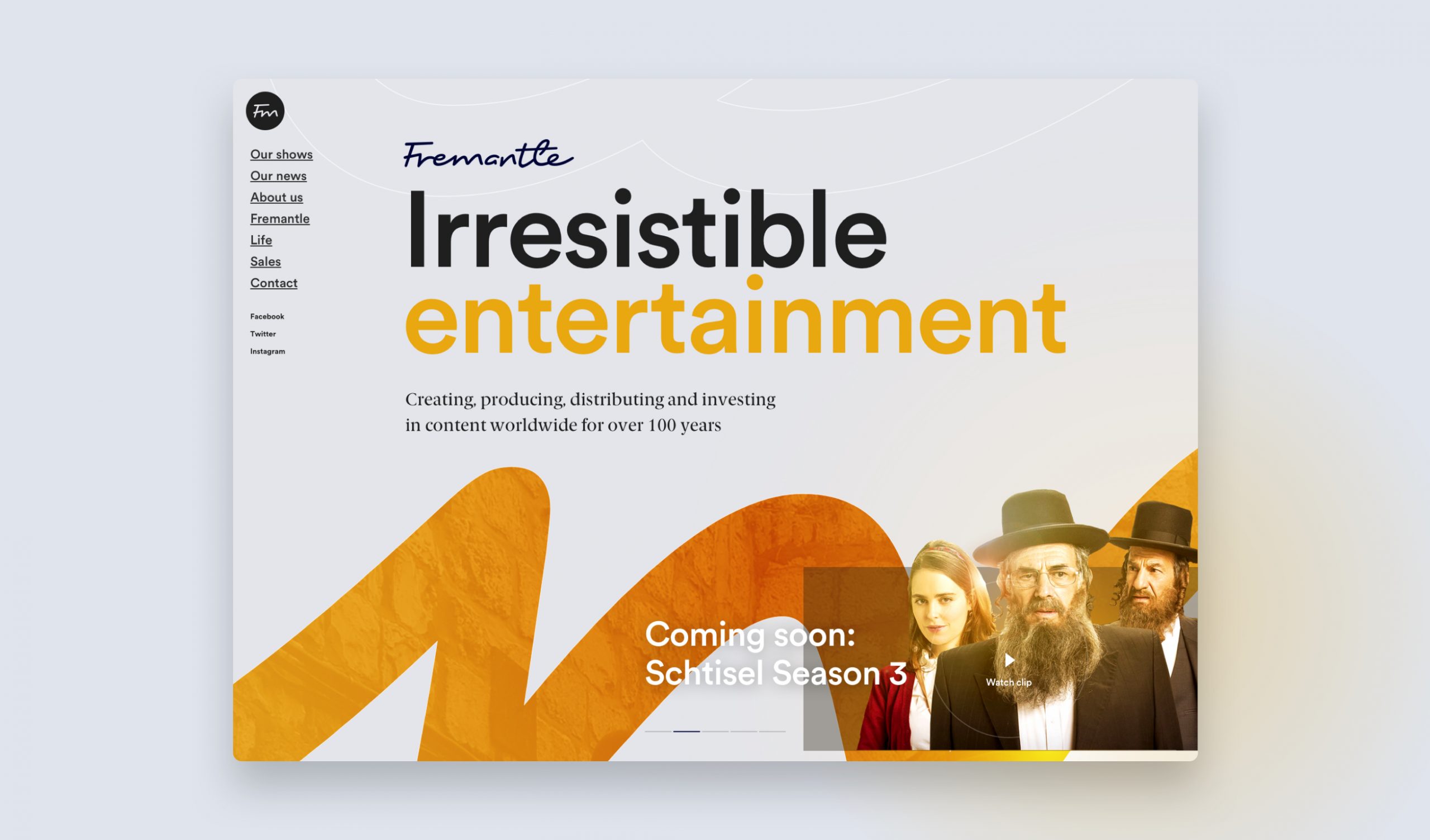
A looping content carousel kept users up to date information on the latest Fremantle news and show releases
The visual design
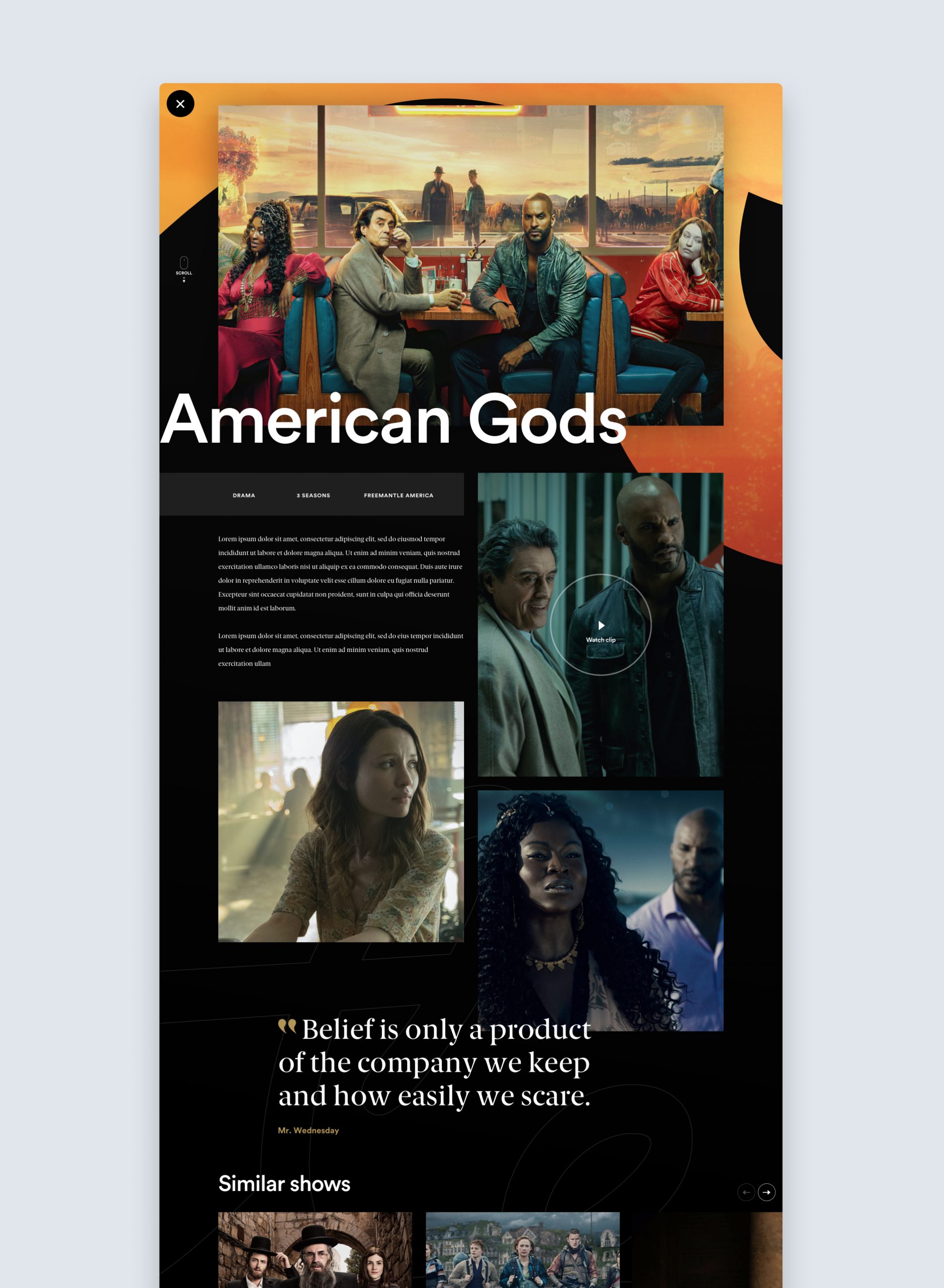
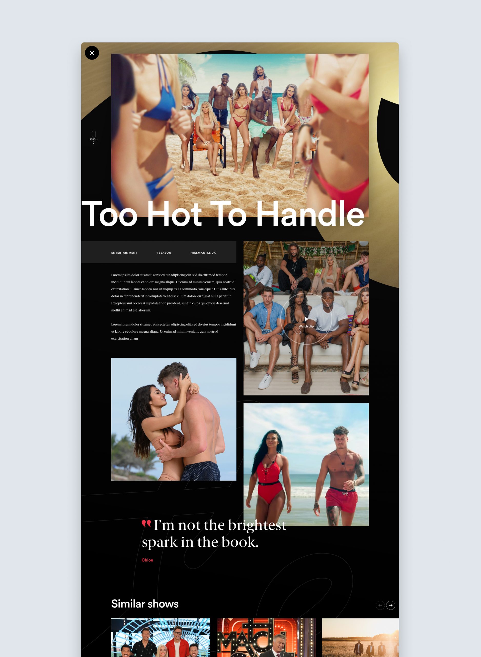
From a visual standpoint the brief also specified a clear intention to wow and surprise users, this allowed room to push the brand into new directions to really give a sense of the creativity and the diversity of Fremantle's content.
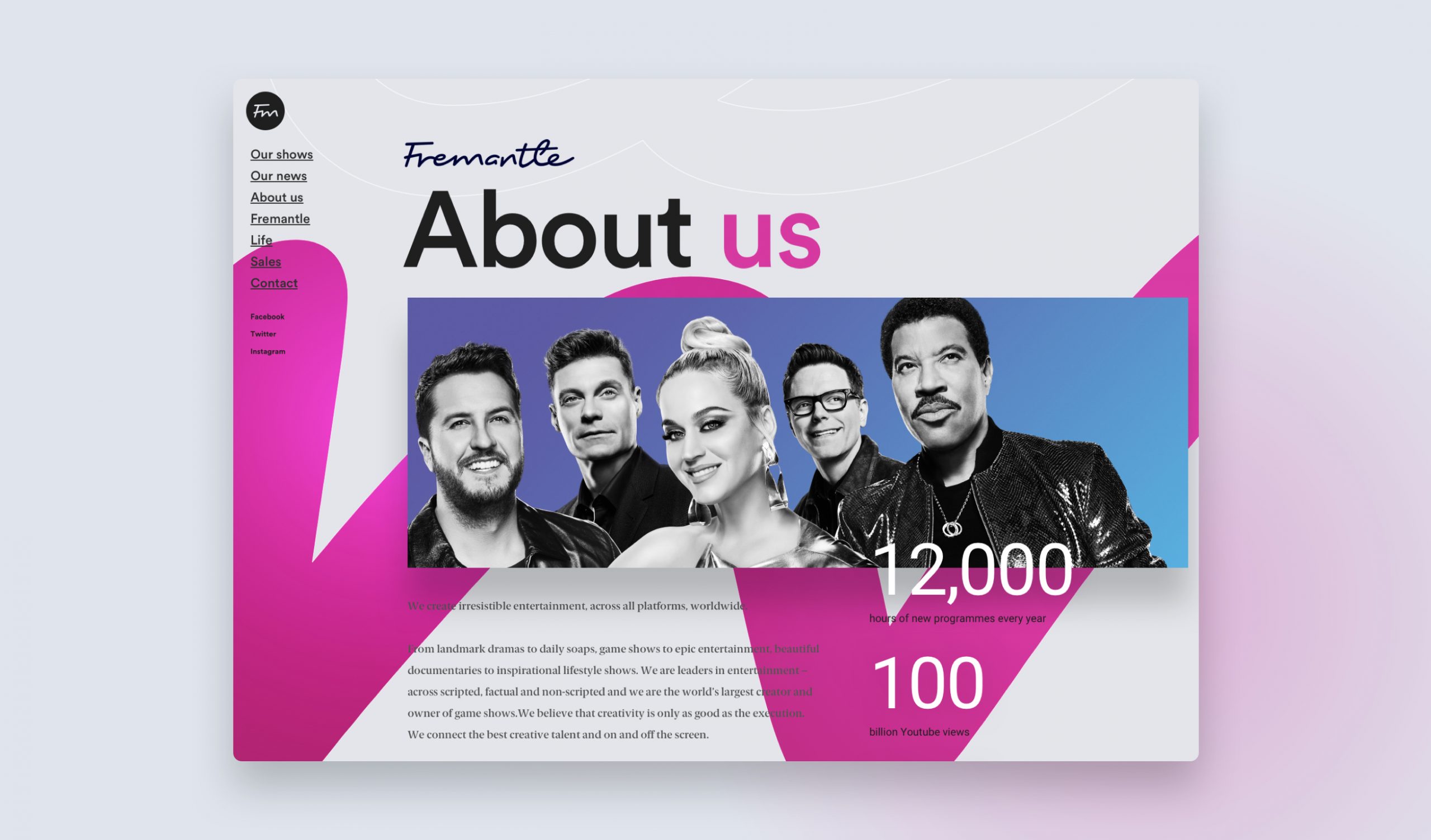
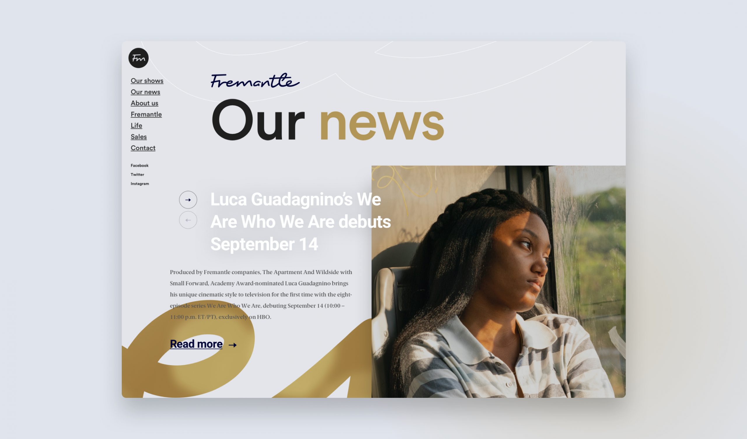
The logo became used only as a keyline device in the background or as a way to house context relevant content in header sections. The key brand colours were largely removed so that any colours or accents came from the show content itself and brand fonts were refreshed to use a cleaner sans serif look.
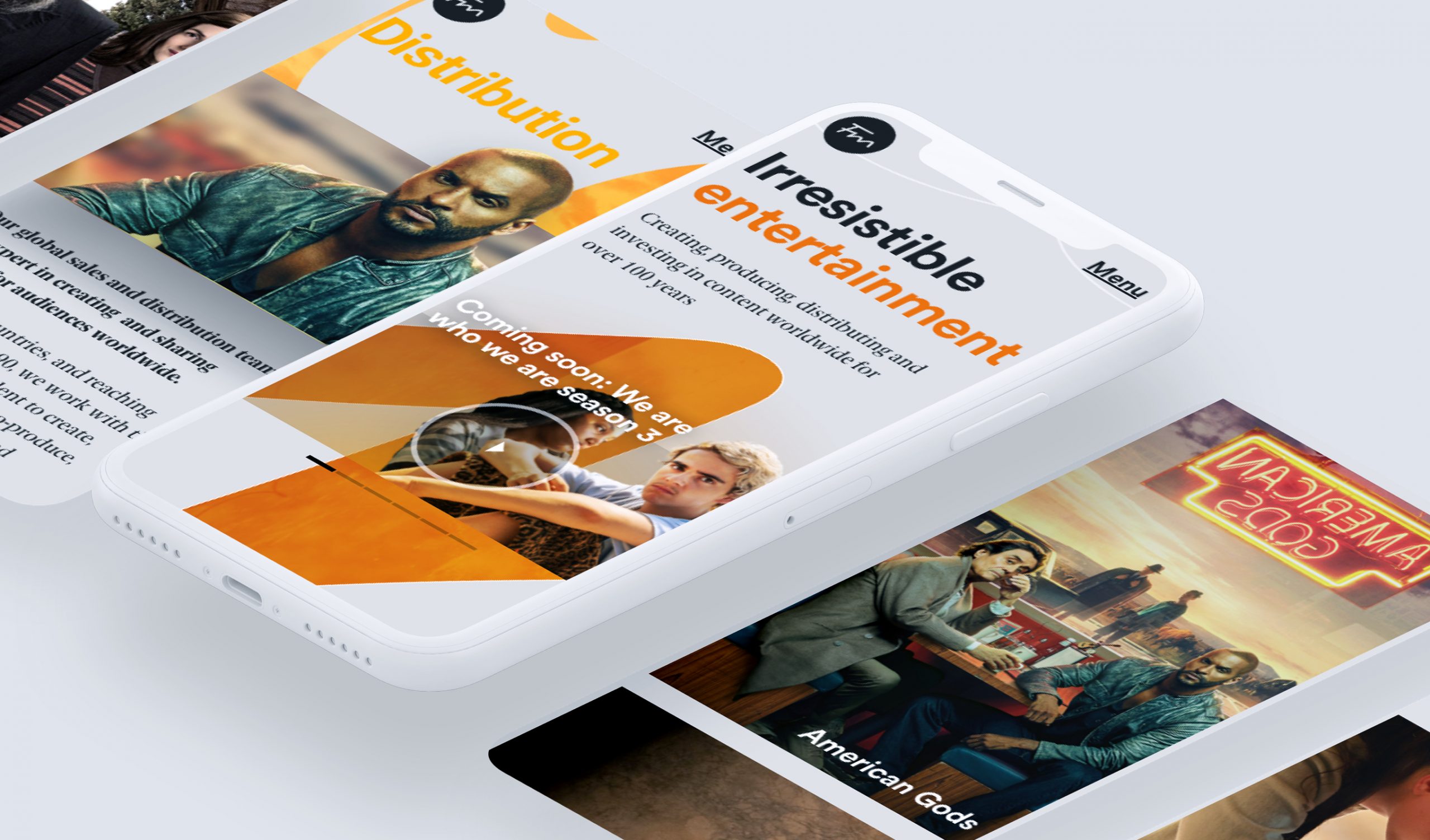
The outcome
A new customer facing site design which reflects the creativity of the Fremantle brand and the diversity of its content. Focusing on sparing use of the brand to allow the rich content to take centre stage.