Arthur Recruitment
Redefining a brand for online
Project overview
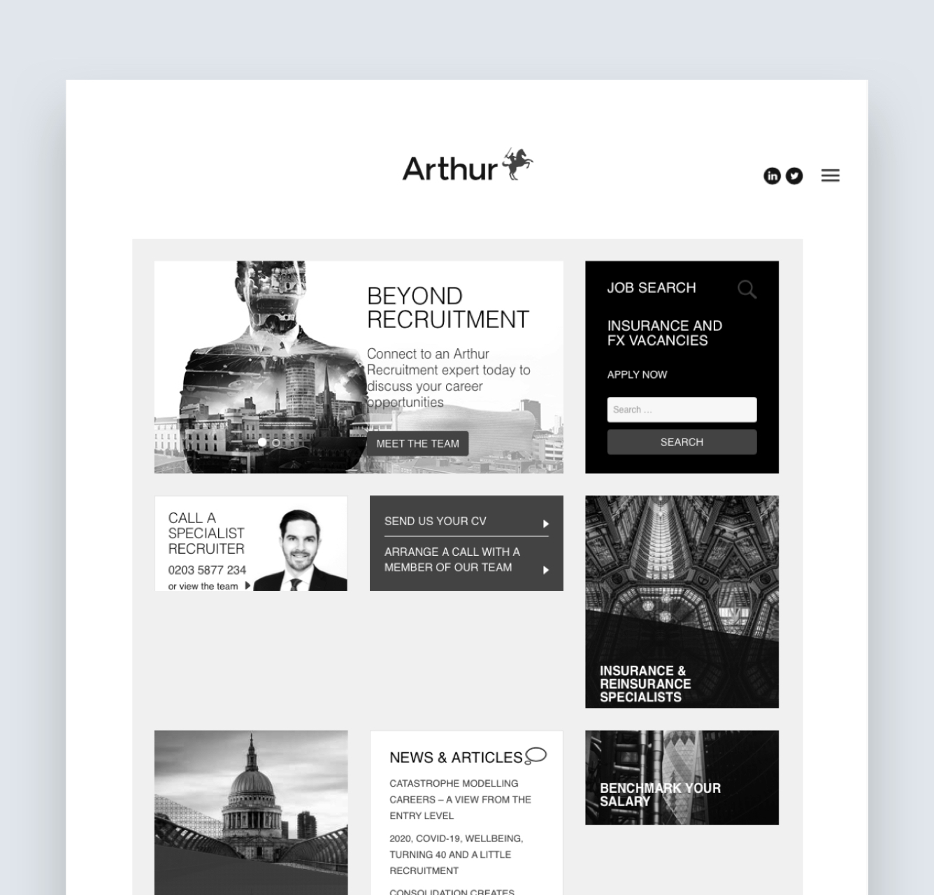
One of London's top recruiters for the finance and insurance sectors, Arthur had just gone through an extensive rebrand and needed a complete redesign of their company website to accompany the new direction.
The aim of the redesign was not only to incorporate the new visual style but also to re-focus the structure away from a resource hub and job portal. To include more concise information in order to work harder as a shop window for their clients, recruiters and candidates.
Role:
Principle designer throughout end-to-end process: Design discovery, requirements gathering, sitemapping, wireframes, prototyping, visual & UI design.

The approach
The key aim of the new site was to encourage new relationships with potential clients, candidates and employees.
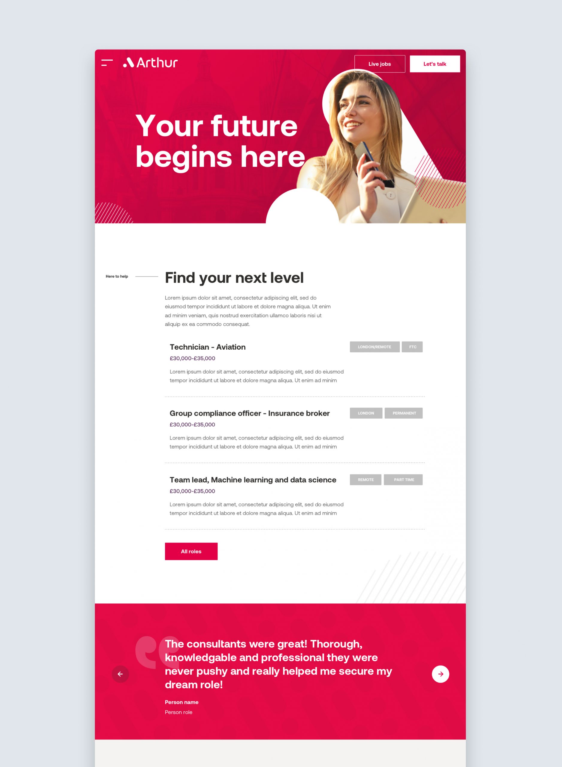
Analysing the current site it became clear that, to achieve this,would require cutting away large amounts of text content and leave only the absolutely necessary. Navigating through the site and completion of tasks should not impose a large cognitive load on users, should be clearly signposted and the new content should be concise and provided in manageable segments.
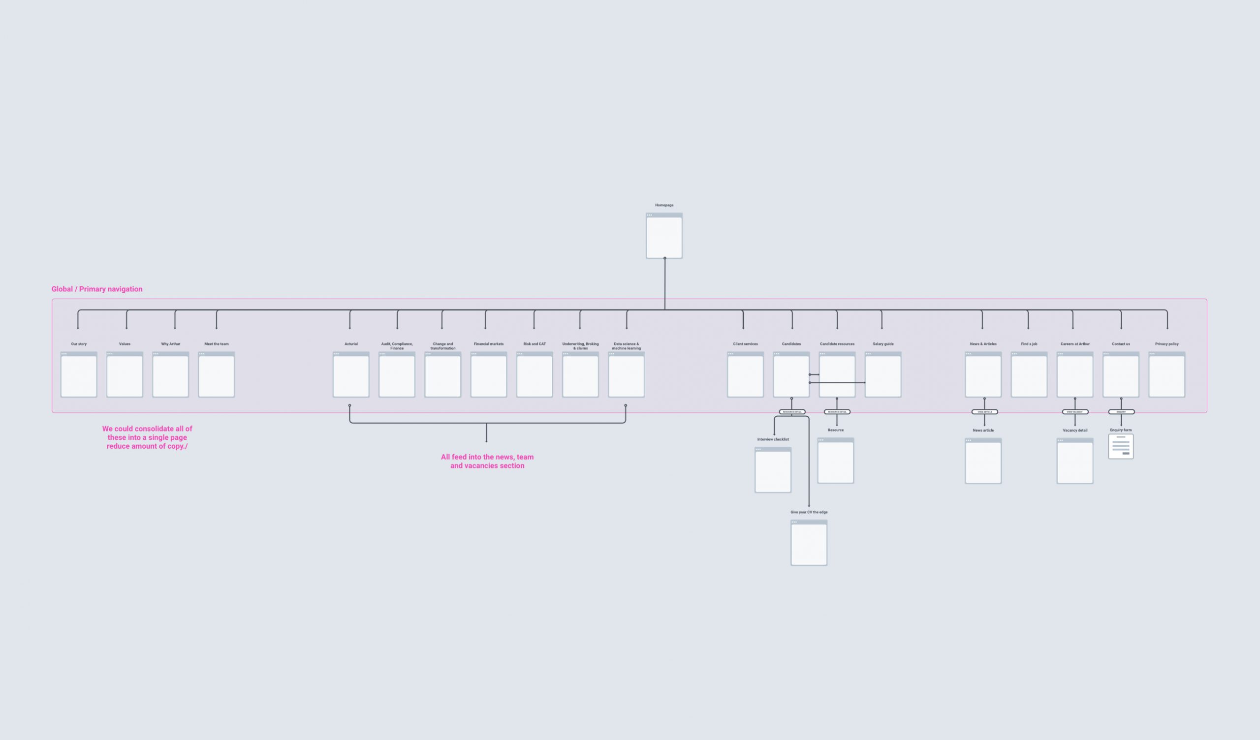
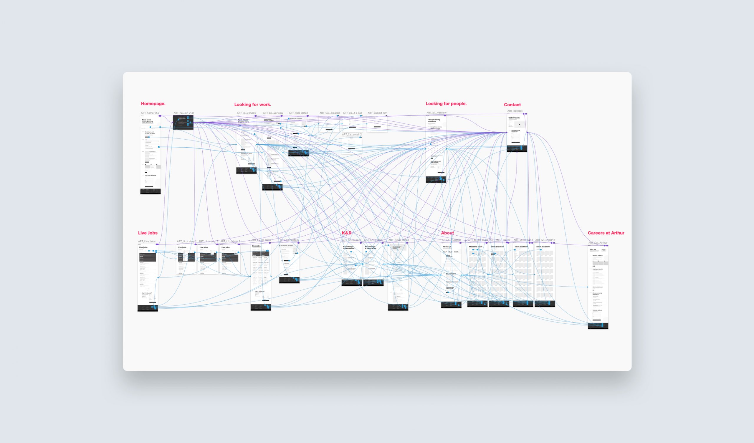
The sitemap for the original site had alot of top level pages in the navigation with no clear funneling or narrative journey for the user groups.
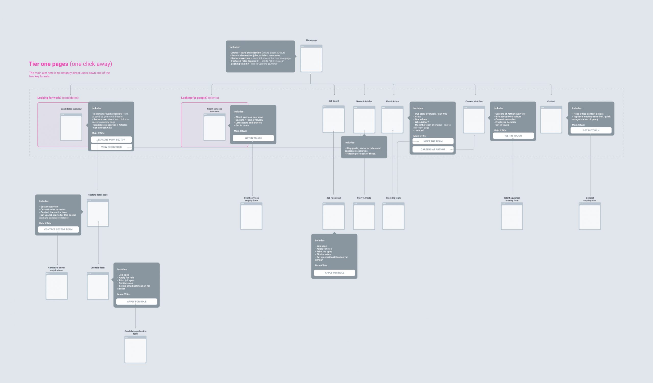
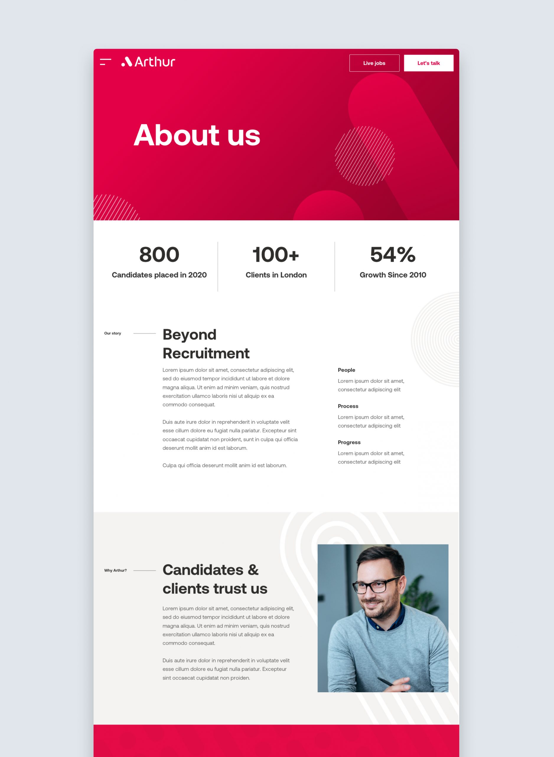
The updated version of this consolidated many of these top level pages into more clearly marked sections with a clearer hierachy and distinct landing pages for each of the 3 key user groups.
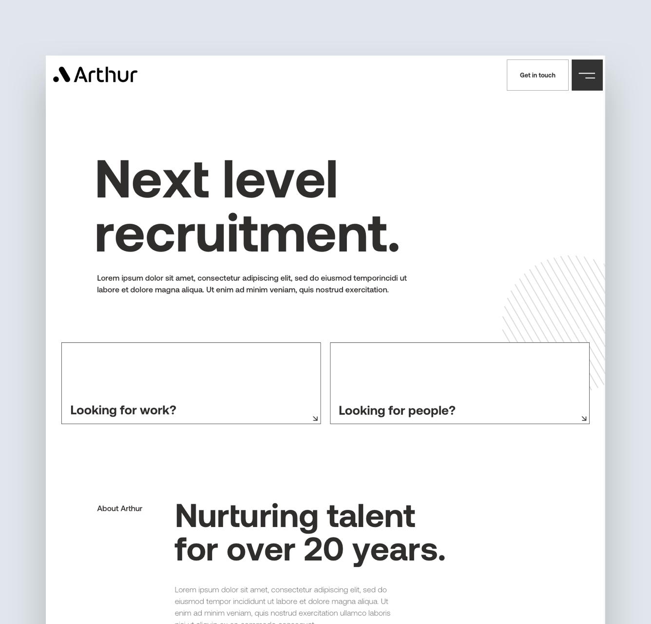
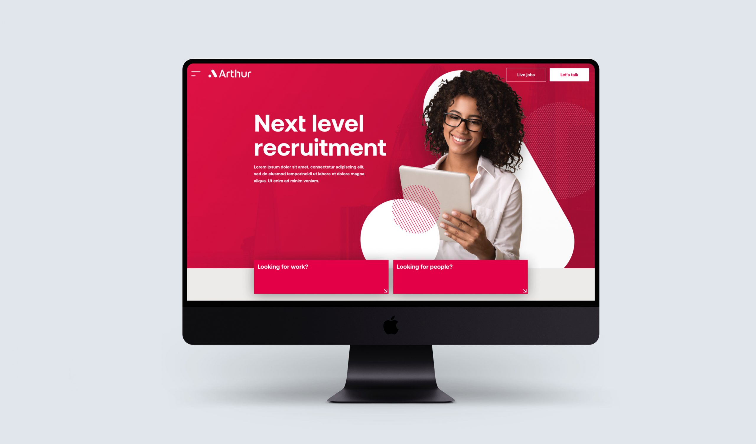
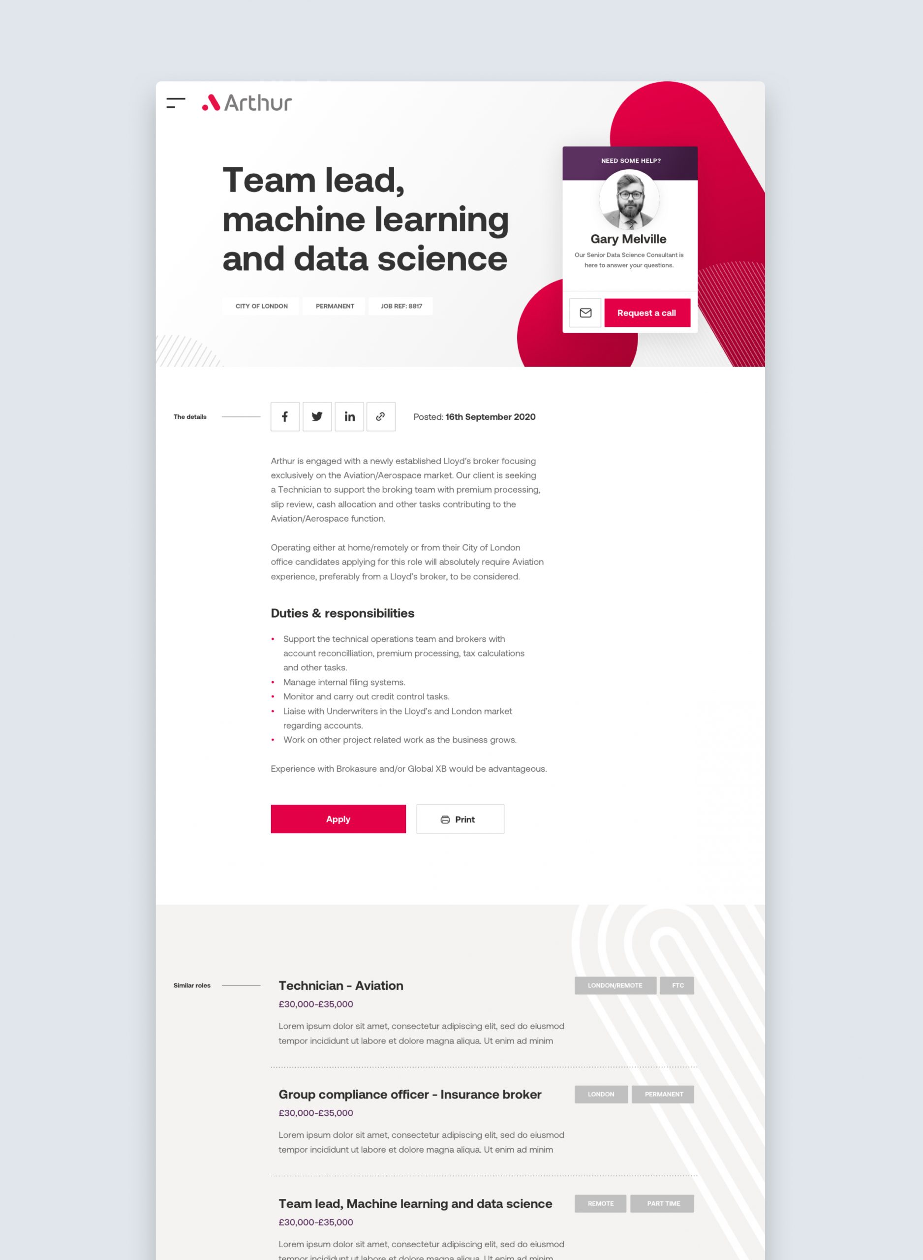
The refined approach to structure and content was applied to the homepage content.
Designing the visual style
Though many of the cornerstones for the visual design had come from the updated brand design. The guidelines had been focussed on an offline approach and so certain considerations needed to be applied to expand these to digital.


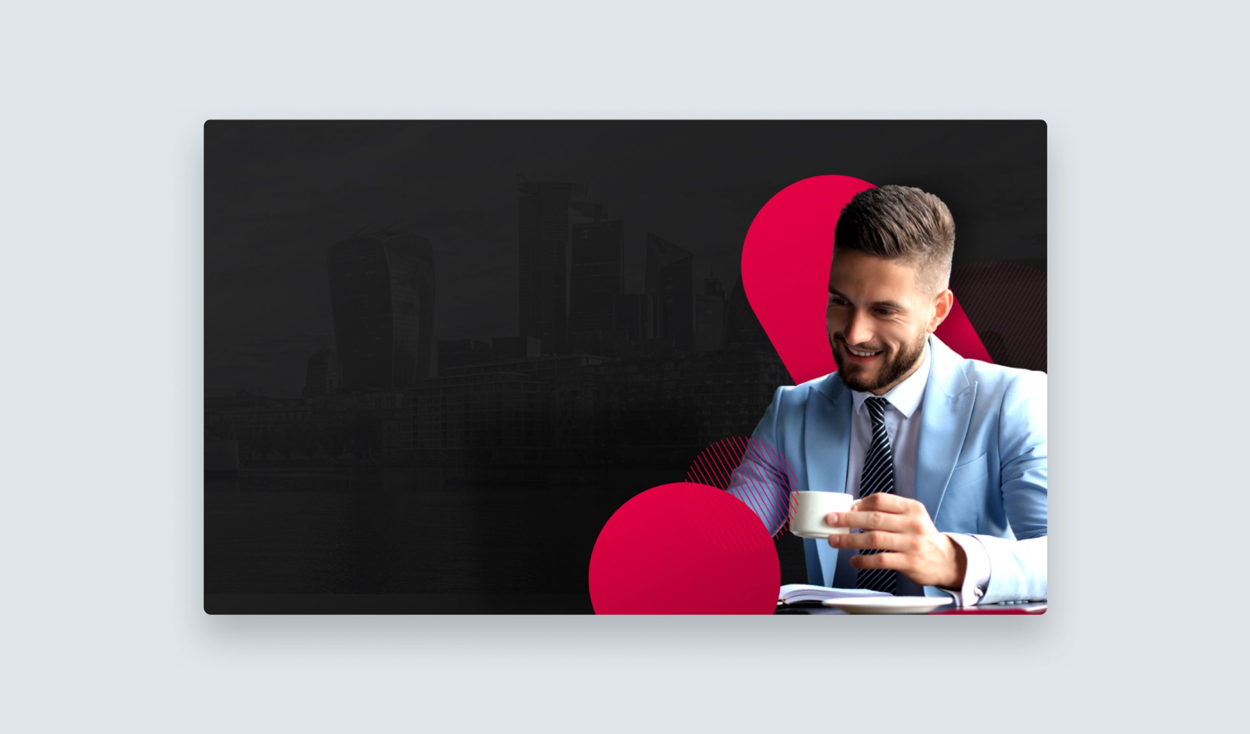
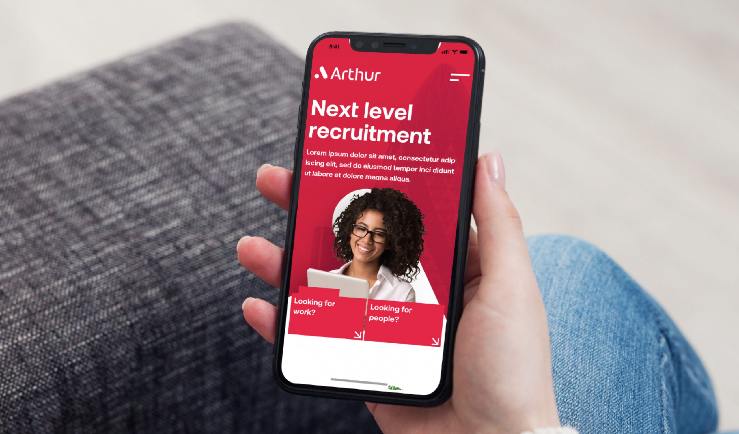
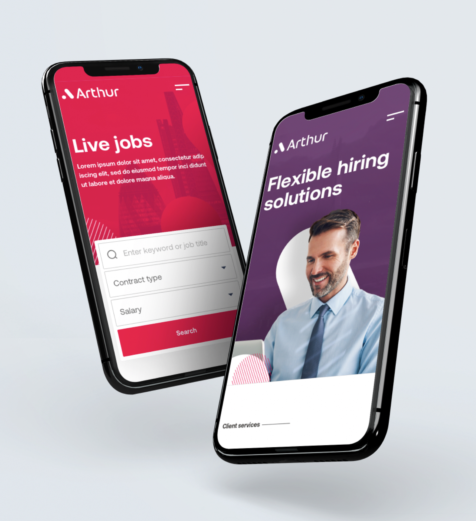
One of the initial excercises involved using brand elements / devices to construct layered images for use in hero sections and to spotlight key content.
The outcome
An updated aite design with a sense of clarity and purpose to accompany an accessible visual tone and new brand design.