
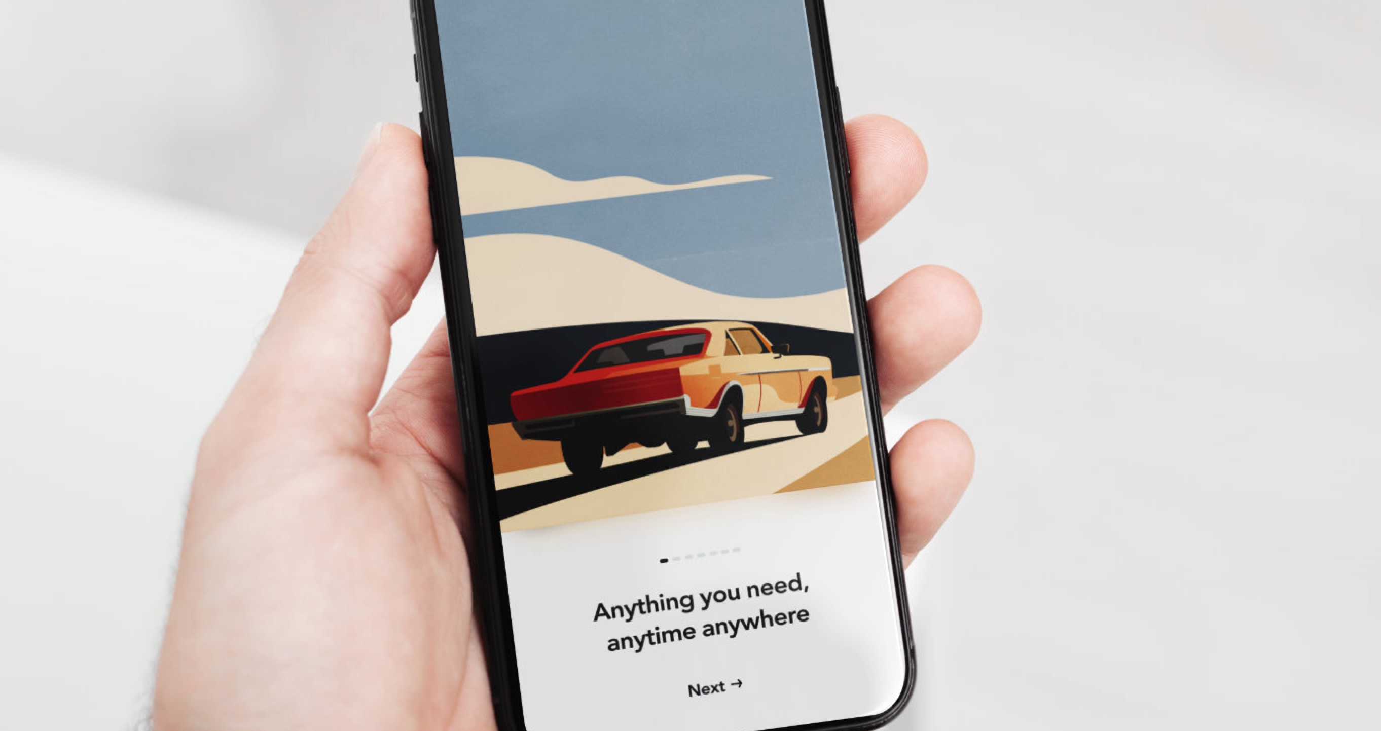
Careem
Building UAE's first Super App Experience
Project overview
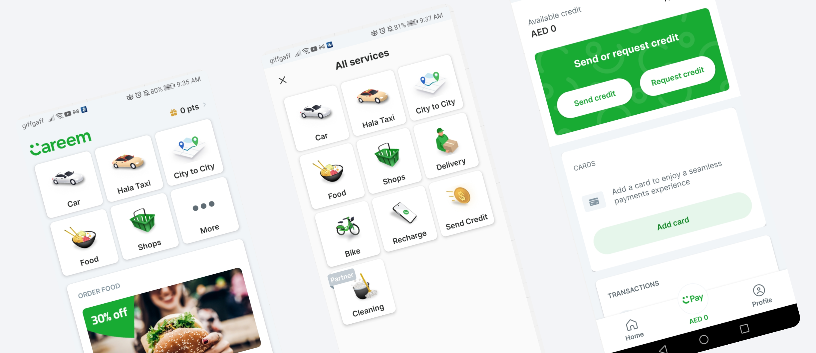
Careem, the leading ride-hailing, food delivery, and shopping app in the MENA region, set out to unify its growing suite of services into a cohesive Super App.
While each service had a strong utility and customer base, the overall product experience was fragmented with inconsistent navigation and UI patterns, no clear hierarchy and nothing tying the experience together.
Principal UX/UI designer :
• Defined overarching design principles and visual strategy
• Led UI concepting and refinement of global patterns
• Built and documented a complete Figma-based design system
Discovery & immersion
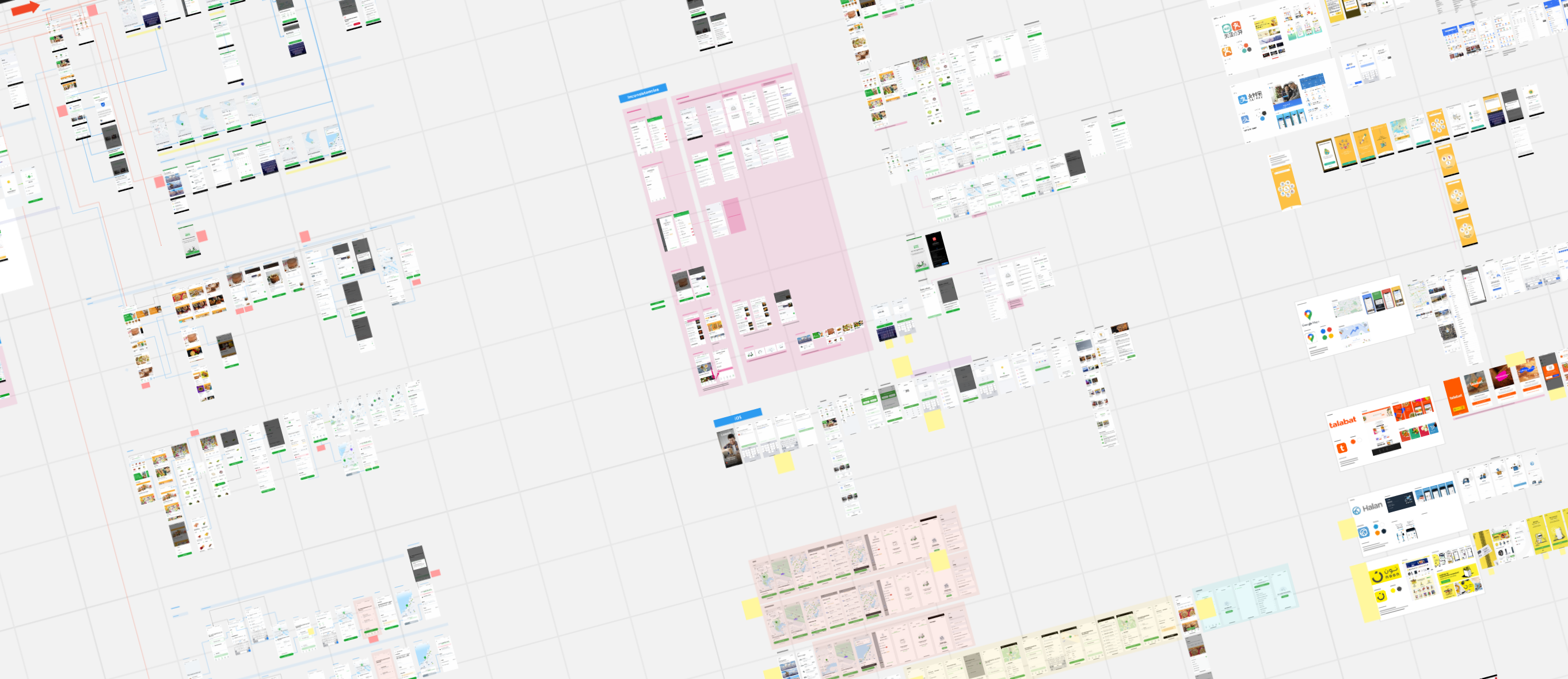
The project started with an initial 3 week immersion phase across business, brand, and product teams to understand:
• Product strategy and roadmap for Super App services
• User behavior patterns across key verticals
• Technical constraints and platform-specific challenges
• Understand the current information architecture and navigation
A Strategy for Effortless Everyday Navigation
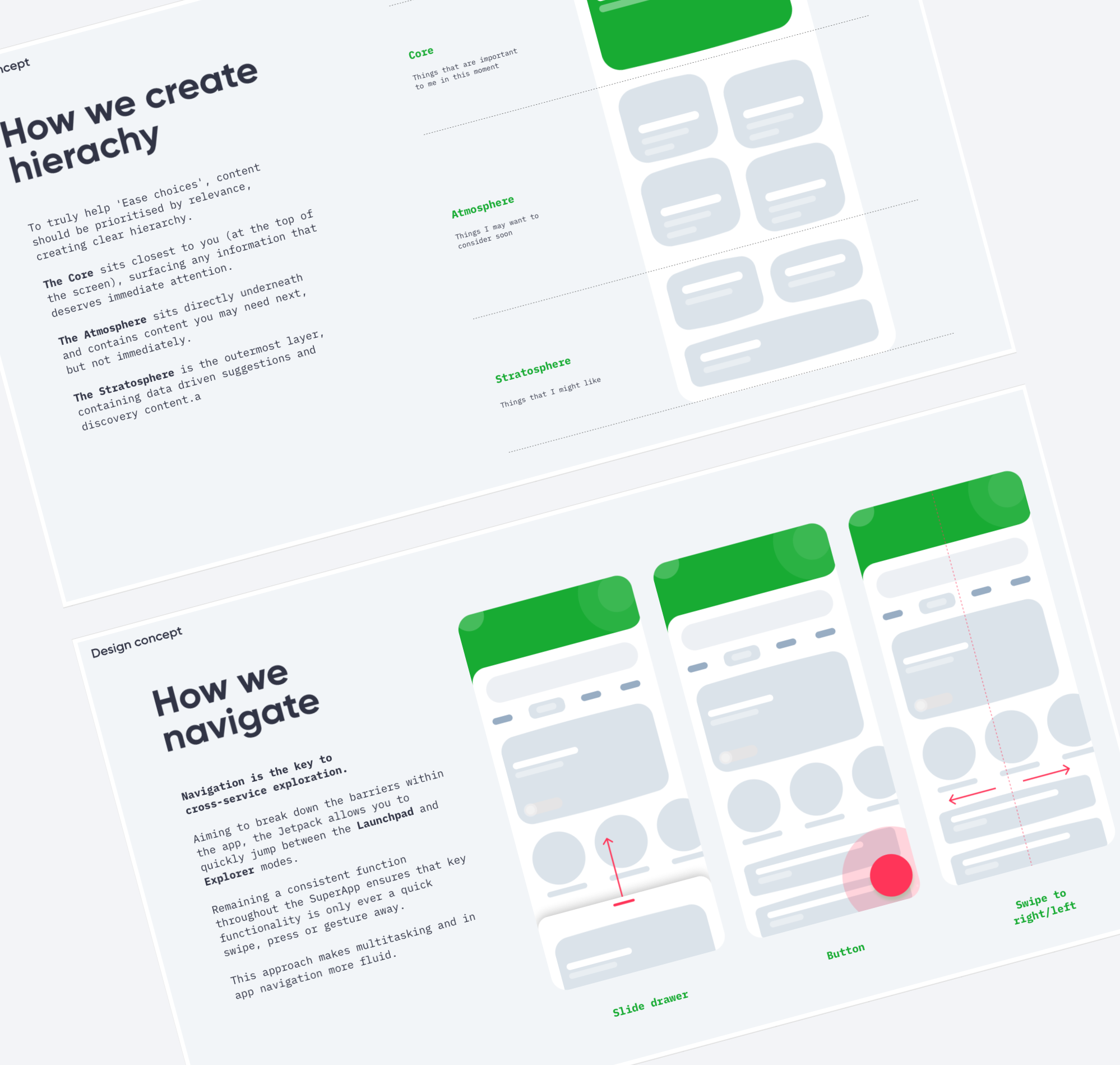
From the initial deep dive, we worked with team at Careem to develop a design strategy rooted in the metaphor of a Jetpack—an empowering tool that helps users navigate daily life effortlessly.
This metaphor guided how we structured hierarchy, motion, and UI intent across the experience.
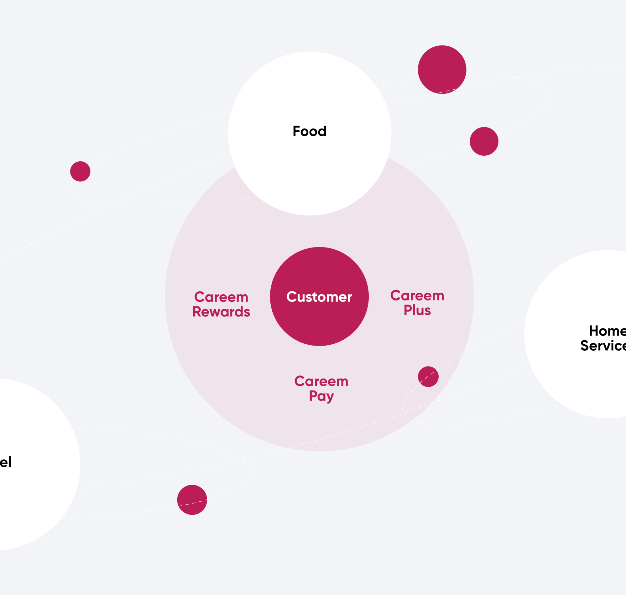
Jetpack in Action:
Solving Key Experience Gaps
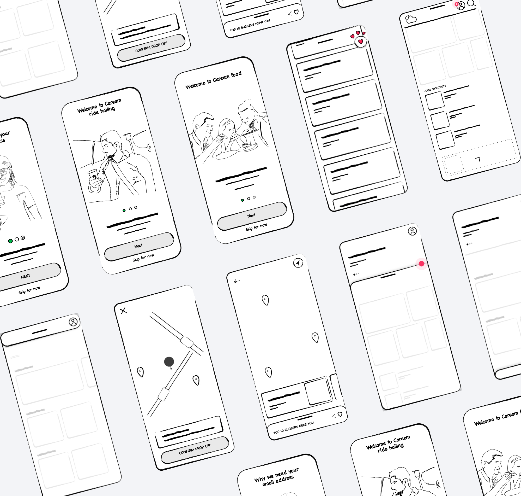
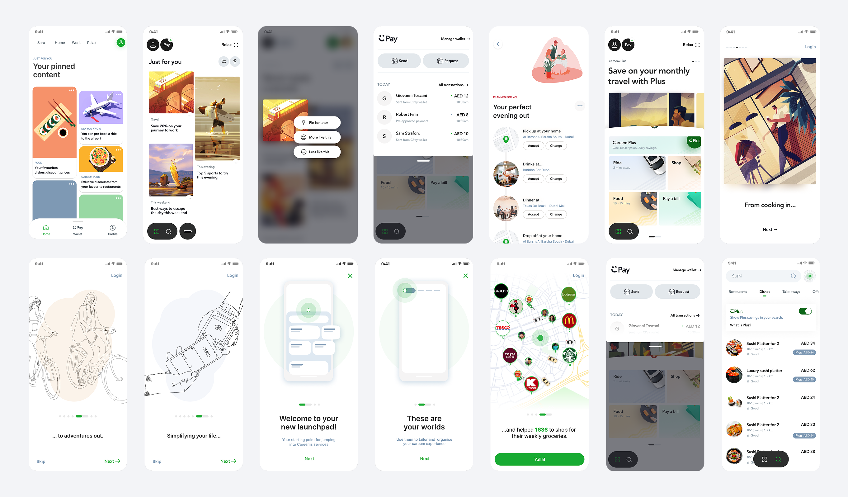
With the strategy defined, we then structured the project into six focused design sprints. Each sprint tackled a distinct challenge through the lens of the Jetpack strategy - including:
• Realising user intent
• Service discoverability and awareness
• Defining a global approach to navigation
• Centralising a single profile & favorites
• Cross service tracking
• An engaging onboarding strategy for NU
Design solutions
With solutions defined across all six sprints, we moved into UI refinement—applying the Jetpack vision across three core layers: visual design, purposeful motion, and a scalable design system to drive clarity, flow, and consistency.
We introduced a calm, neutral palette, a warm, readable typeface, and consistent layout rhythms to reduce visual noise and cognitive load—while using contrast to clearly anchor global actions like search and navigation across the Super App experience.
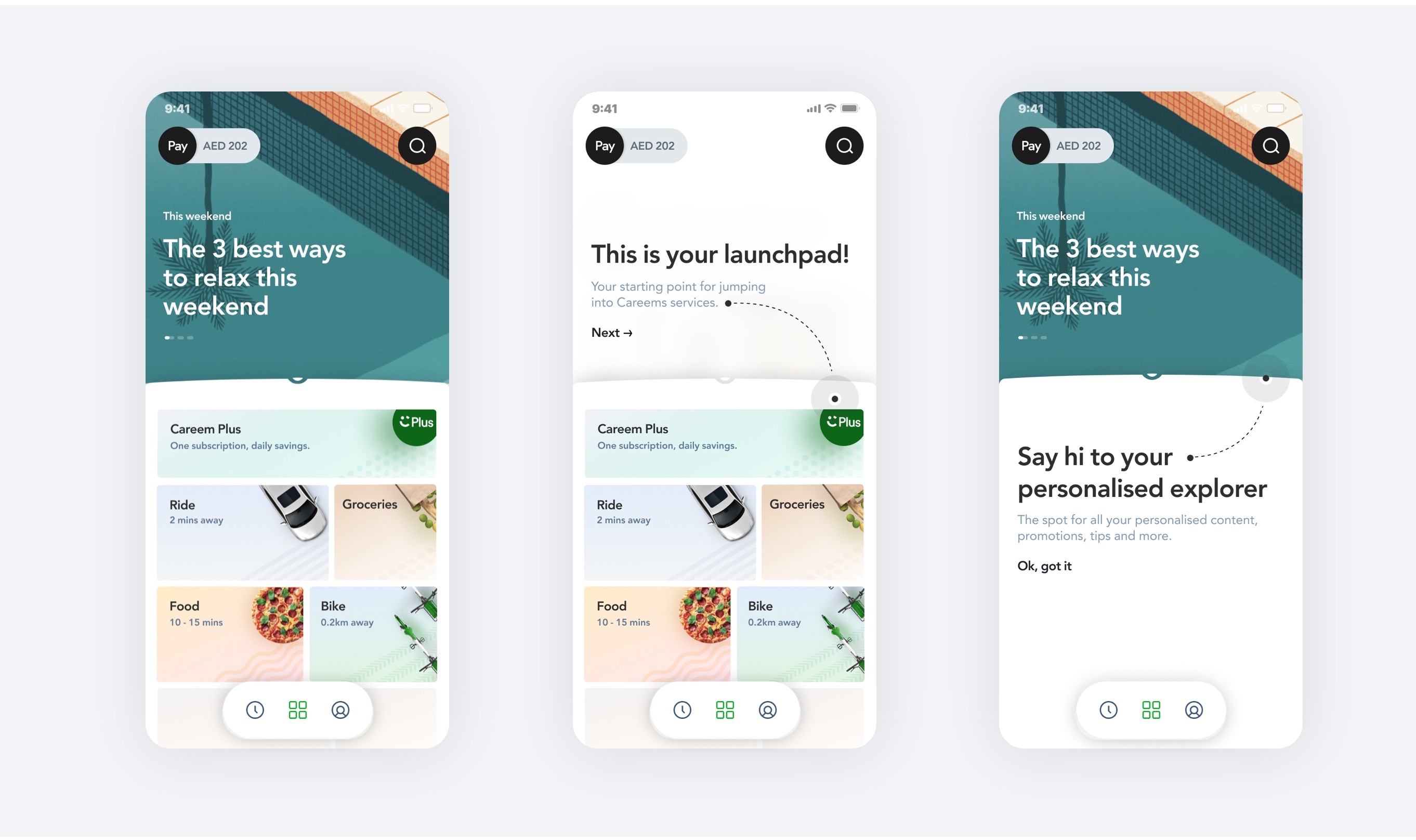
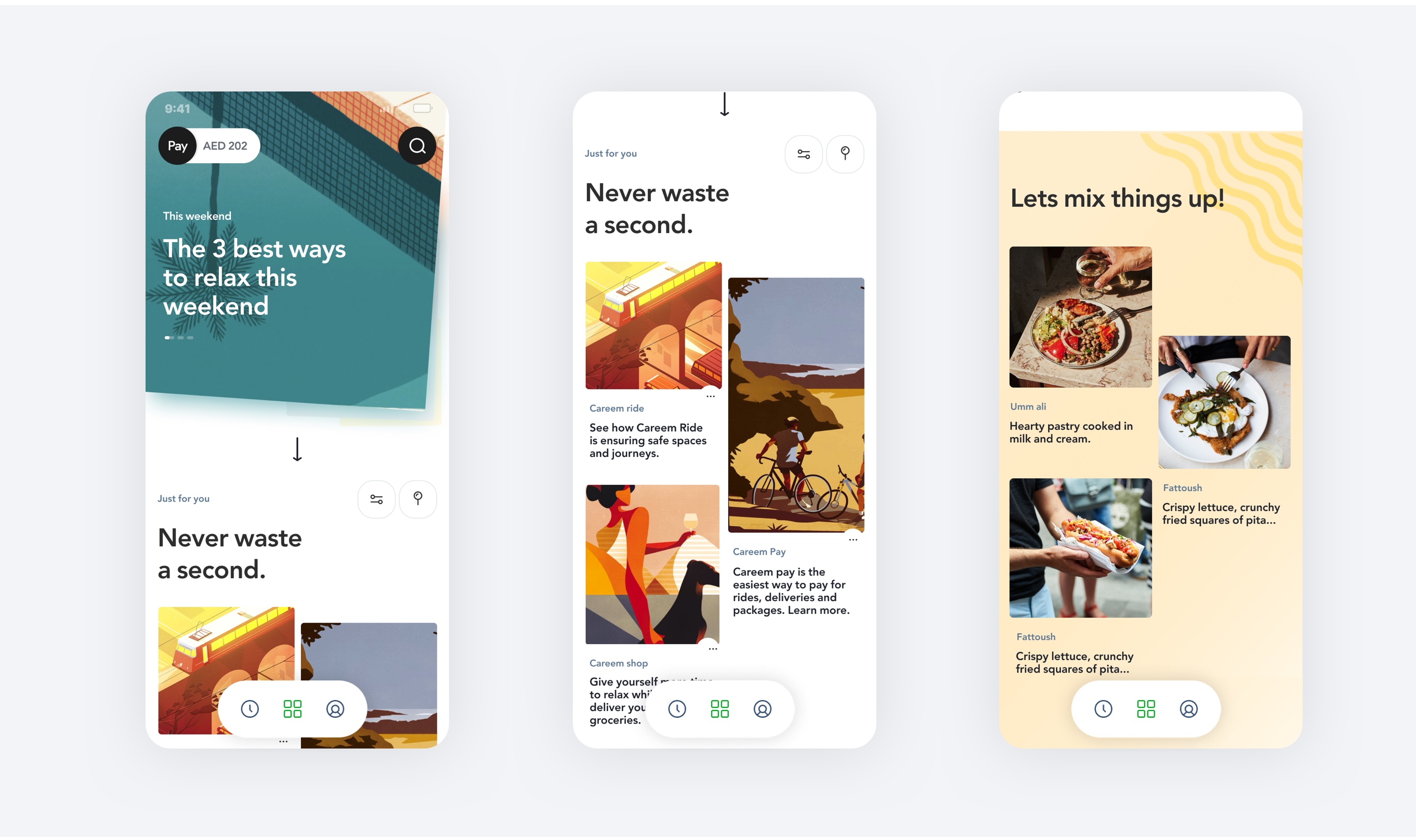
Directing Behaviours
Layering was used to divide intent and discovery. Each accessible with intuitive gesture controls allowing either focussed task based utility with leisurely content scrolling.
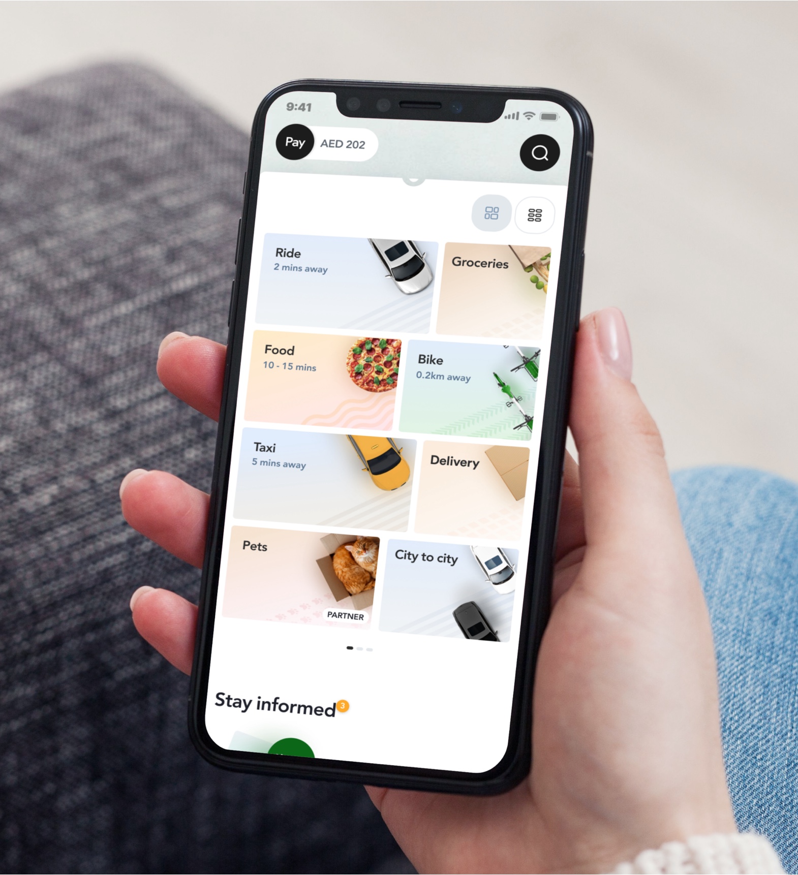
Motion & Interaction Principles
We crafted a motion language that reinforced the Jetpack metaphor—using smooth transitions and purposeful microinteractions to guide attention and make switching
between services feel effortless and intuitive.
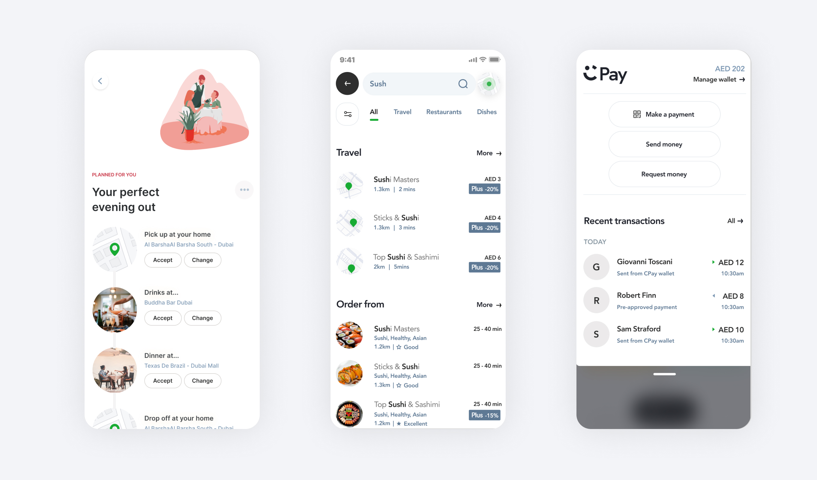
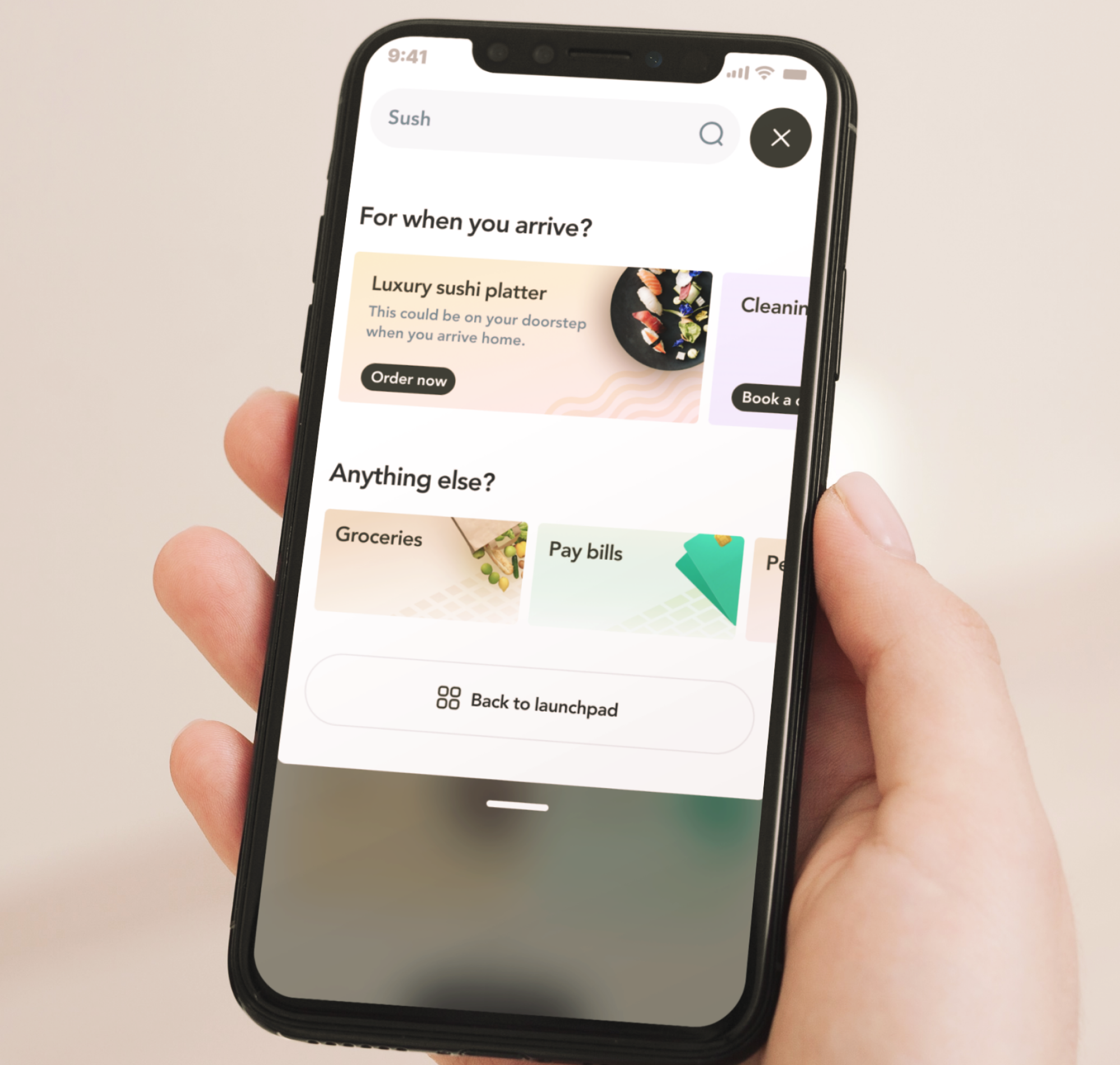
Feature concepts defined ideas around Global Search, quick access to personal transaction data and a day planner.
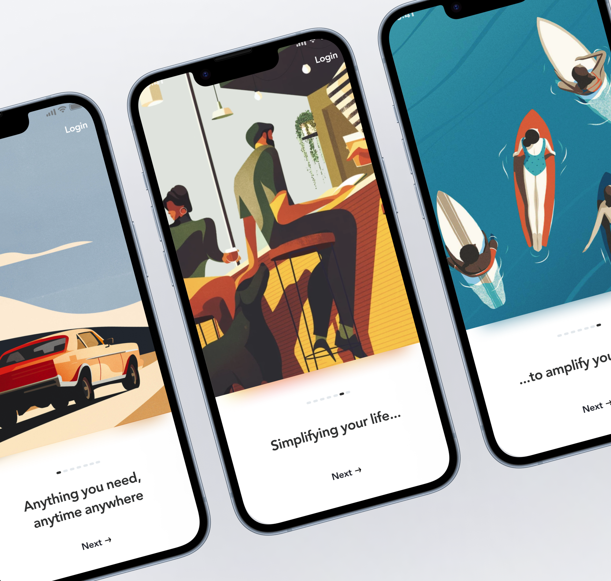
Systematic Design Toolkit
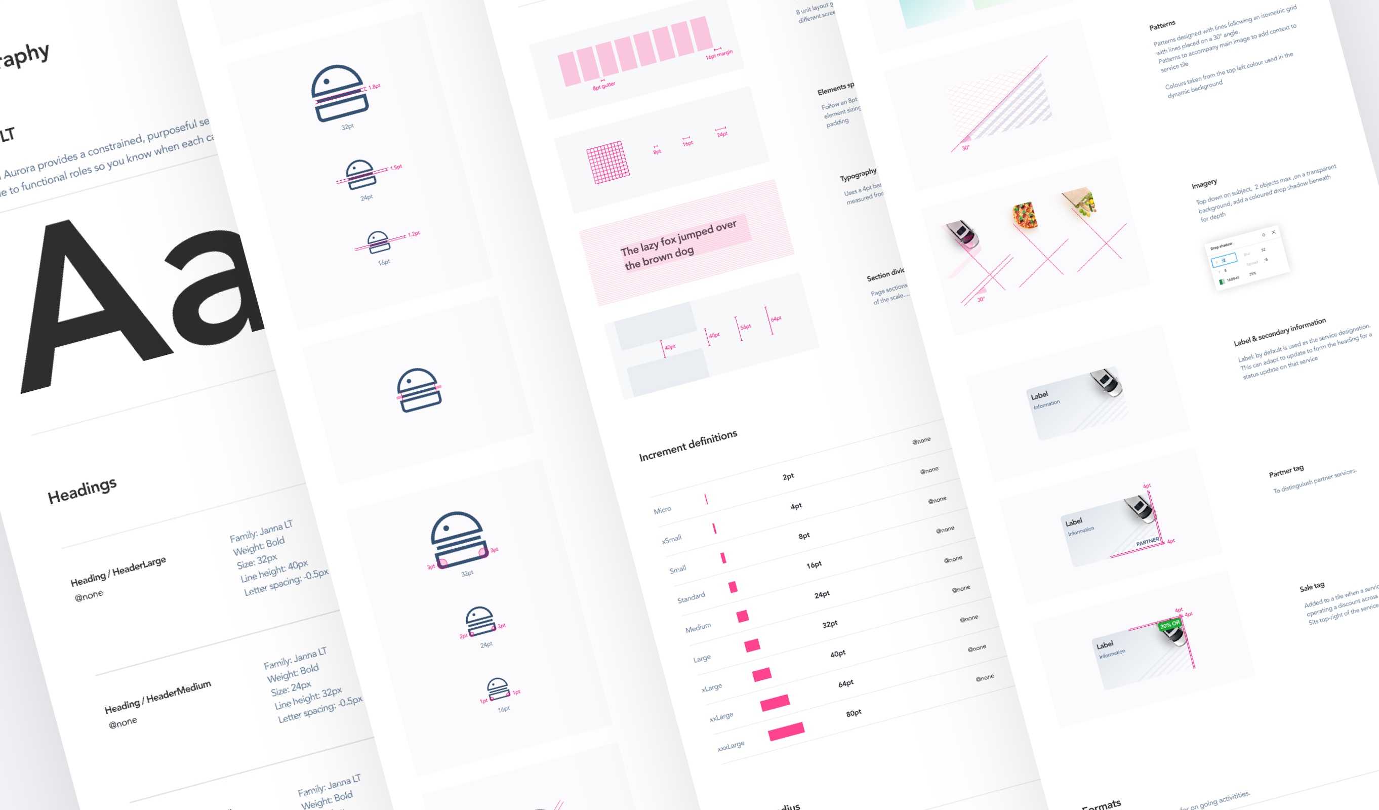
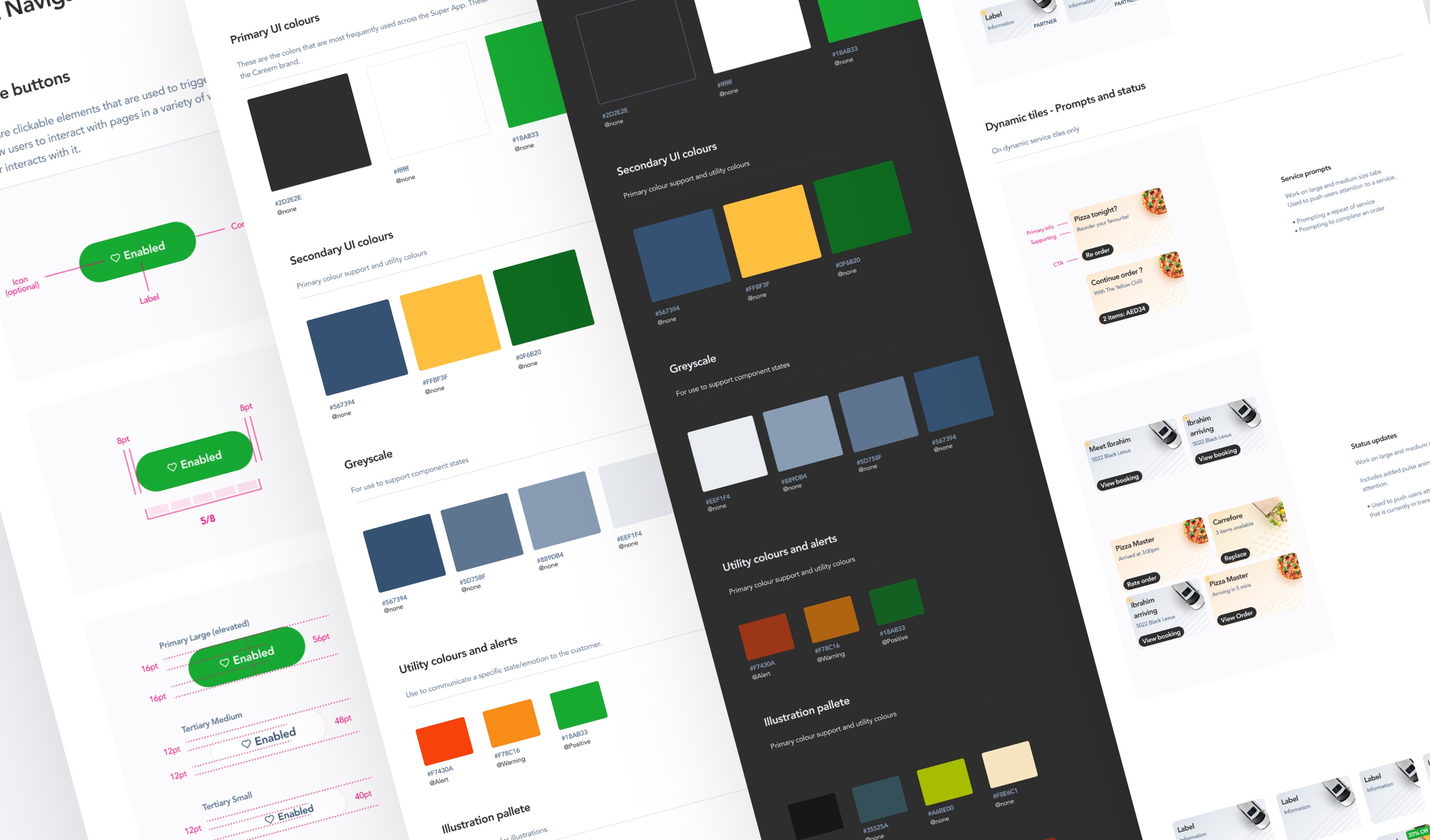
We rebuilt the design system in Figma from the ground up—modular, token-based, and fully documented to enable rapid, scalable product experimentation.
The outcome
Although this was a North Star initiative rather than a shipping release, it laid the foundation for lasting impact.
The work delivered a unified design vision embraced across brand, product, and marketing; a scalable system for future UI delivery; and a strategic anchor for personalization, onboarding, and cross-vertical discoverability.
Several elements—like global navigation and visual refresh—have since rolled out across the app, and the design toolkit became the foundation for the design system now powering the Super App today.
